Your logo will represent your company in a variety of ways and places. Here’s how to ensure it becomes iconic.
Ah, logos. For such an essential brand feature, it’s amazing how much of a struggle they can be for some businesses. Or maybe it’s not amazing—many businesses have an emotional attachment to their logo, even if it’s not a very good one. Others may struggle to get their right after years of iteration.
However, for a logo to meet the needs of most companies, it must be functional in a variety of different conditions. And to achieve the instantly-recognizable status enjoyed by major brands around the world, it should follow a few other rules as well. Here’s how to make sure your logo passes the test.
1. It’s simple.
Think about some of the world’s most iconic logos: Nike, McDonalds, CocaCola. If asked, you could probably sketch a reasonable facsimile of each of these logos within a minute—even if you aren’t that much of an artist. Logos comprised of simple shapes and clean lines are easier to remember, but often harder to create. They involve distilling a lot of complex ideas into just a few strokes.
A few famous logos, like Starbucks, are more complex. But you’ll notice that every time Starbucks goes through a rebrand, their logo simplifies. In doing so, it drops some of the unnecessary elements of its design, and becomes more iconic.
2. It’s unique.
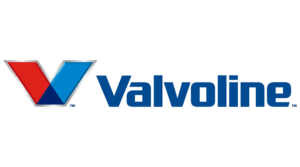
Take a look at the Valvoline logo:

Now look Google’s old AdWords logo:

See the problem? I can’t tell you how many logos we see that are some variation of a two-colored folded V or A with a dash of gradient or drop-shadow. If your logo immediately reminds you of someone else’s logo, you have a brand problem, because it will assuredly remind other people of the same.
That said, creating a unique logo is easier said than done. The temptation is to add more elements to the design, but that violates the previous rule of keeping it simple. Instead, go back to the basic shapes and forms. Edit the big picture until it achieves something original, and avoid going overboard on the details.
3. It passes the color test.
It’s obvious that logos should incorporate the brand color(s) to help reinforce the brand identity. However, many designers find it helpful to do their first designs in black and white or grayscale to ensure the design is clear and recognizable no matter how it’s colored.
After all, there will frequently be times where your logo may need to appear in different color schemes. These may include black and white, single color, or in inverted colors. It’s rare that a logo looks as good on a light background as it does on a dark, so you will need to create variants that can fit these different applications.
Fortunately, well-designed logo can clear this bar with ease. Those that can’t tend to run into difficulty due to the overuse of gradients in the design, or because their logo has become too complex.
4. It can be resized.
Another place complexity can become a problem? Sizing. Many businesses realize this the moment they try to print their logo on a business card. What once looked nice on a computer screen now appears muddled and difficult to decipher.
The same problem can happen in reverse. Blow a logo up to the size of a billboard, and it can start to look clumsy. Blocky. Overbearing, even.
And, of course, digital formats will have an effect, too. Your logo will appear as the favicon in browsers, on phone apps, and on social media profiles. In all these contexts, if it isn’t clear and identifiable, it will be letting your brand down. Fortunately, avoiding this problem is simple: Test it out, and if it doesn’t work, try a new design or create a variant for small uses.
5. It draws on relevant imagery.
Logos can be abstract or literal, but they should never be a non-sequitur. Ideally, the connection between the imagery in your logo should make an immediate connection for anyone viewing it.
I think the Girl Scouts logo is a great example of this, albeit a fairly literal one. The sequence of profiles in contrasting colors also passes the color test, while the symmetry of the overall shape keep the entire design looking clean and symmetrical.
6. It uses appropriate typography.
Many logos are purely text-based. This works just fine for many companies, but only if the right font is used.
The four main font choices are:
- Serif: eg. Times New Roman. Classic, authoritative, and old-fashioned.
- Sans-serif: eg. Helvetica. Clean, sleek, and modern.
- Script: eg. Lucida Calligraphy. Elegant, handwritten, homey.
- Display: eg. Stencil. Highly decorative fonts used sparingly for signs or logos.
Any of these can be used for a logo, but bear in mind the connotations attached to each.
The right logo design can take you a long way.
You want you logo to represent your brand for years to come. So while you may initially become attached to one idea, remember to test it against other criteria so that you don’t make a miss step. If your favorite logo design isn’t legible in small sizes, or doesn’t work against a dark background, it’s time to recalculate before you design yourself into a corner.
