
Wondering how implement an accessible web design on your site? Here’s where to start.
As we covered in our recent post on web accessibility, ensuring that everyone can use your website is important. And while creating a perfect website might not be easy, getting most of the way there only requires designers to follow a few simple principles.
You may need to update part of your website, add or remove certain features, and do a general accessibility audit. But doing so will probably pay off in a cleaner, more user-friendly website as well as a more accessible one.
This list doesn’t cover every possible aspect of building an accessible web design Michigan. But it will get you started.
Accessible web design for the visually impaired.
Visual impairments span a wide range of conditions, from complete blindness to limited scope of vision and color blindness. For the most part, creating a web design that accommodates the visually impaired means understanding how screen readers work. Remember that if information on your website isn’t included in text that screen readers can read, that information is not accessible to blind people.
Alt tags
One of the easiest steps you can take to improve user experience for the visually impaired is to include information in alt tags. An alt tag is the text a web browser displays if a connection is too slow for the image to load fully. However, alt tags are commonly misused—or outright abused—by people who either misunderstand their purpose or want to use them to manipulate search engine rankings through keyword stuffing.
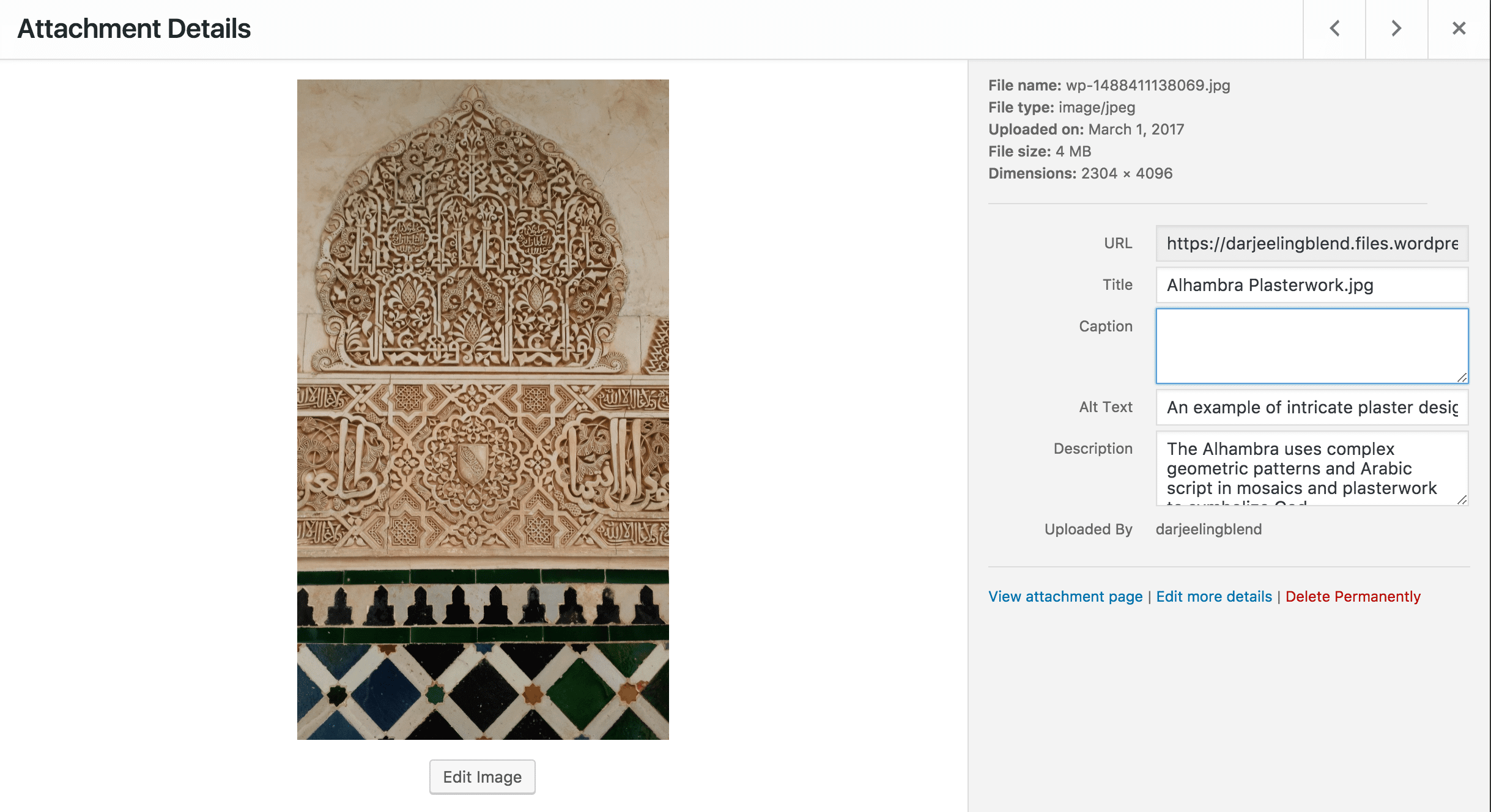
You should be able to spot the alt text field for an image when you add it to your media library in WordPress.
Used properly, the text in alt tags should be a stand-in for the image. That means they should either describe the image accurately, or else should provide a meaningful substitute.
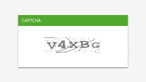
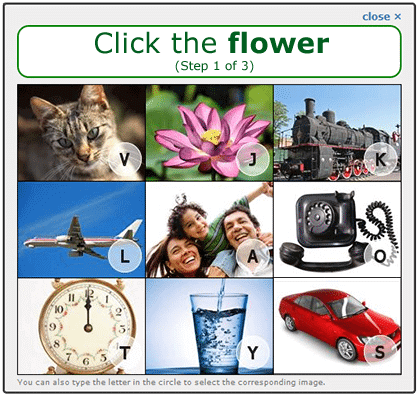
Are the “v” and “x” lower case or upper case? Does it matter? What if one is and the other isn’t? These CAPTCHA are the worst.
CATPCHA
We all get frustrated with those warped images of numbers and letters that are easy to misinterpret. However, they can be especially irritating for visually challenged users who can’t see them well enough to complete the CAPTCHA. While CAPTCHA are important tools for cutting down on bots, any that you use on your site should come with an audio alternative. Even better, newer options allow users to solve a simple math problem or tick a check box instead.
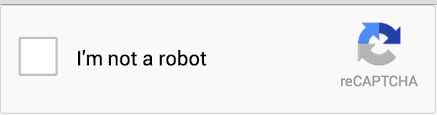
These reCAPTCHA, on the other hand, are the best.
Headers
Header tags (H1, H2, H3, etc. in HTML) do more than provide visual hierarchy for the readers. They also help screen readers navigate the content of a website. Without headers, a user who relies on a screen reader must listen through an entire page to find the information they’re looking for.
However, with header tags, users can jump ahead to sections that are most relevant to them. This also means that you should use header tags in hierarchical order. H1 is a header, H2 a sub-header of H1, H3 a sub-header of H2, and so on and so forth. The style sheet on your website should reflect this. Remember, headers serve a function—they’re not just there to look nice.
Links
When a screen reader reaches a link in a body of content, it pauses and says the word “link” before reading the hyperlinked text. This makes it irritating to have a high density of links all in one place, or to use non-descriptive anchor text with these links. Imagine having to listen to “link, here, end link” a dozen times in one article. But with descriptive anchor text, that link reads something more like “link our recent post on web accessibility end link.”
Ads
As much as many of us complain about online advertising, we can still recognize that it’s one of the main ways many websites make money. It’s also an important tool for many businesses trying to bring their product to the market. However, there are good and bad ways to do online advertising.
Video ads that auto-play cause a lot of frustration to people who depend on screen readers to tell them what’s on a website. And ads that insert themselves into the middle of content can be similarly confusing. If you can, avoid using intrusive advertising methods on your website, and save the video ads for YouTube.
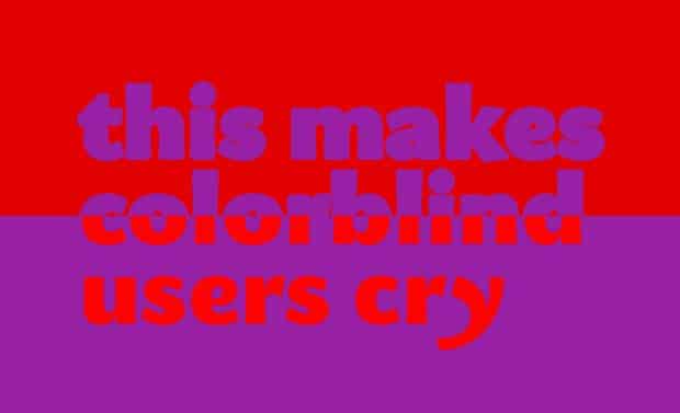
From Alex Bulat’s post, “Why Color Blindness is No Longer a Problem for Web Design.”
Color blindness
Color blindness is an incredibly common condition, especially among Caucasian males. While many websites are perfectly functional without many modifications, there are some pit holes that you could still fall into, if you aren’t aware of how color on your site appears to people with color blindness.
Fortunately, the principles behind creating a user friendly design for color blind individuals are pretty easy to follow. Use colors that contrast in hue, lightness, and saturation. Don’t create anything that relies solely on color to communicate information. And use textures, patterns, and symbols, as well as color, to aid with visual differentiation.
Accessibility for the hearing impaired.
The Internet is largely accessible for hearing impaired users, except when it comes to audio/visual content. Even videos that include some text on screen often don’t include everything being said in a voice-over. Here’s how to handle videos, podcasts, radio interviews, and any other audio/visual content on your site.
Captions and subtitles
It’s obvious that captions and subtitles are important for hearing impaired users. But this is also a good idea for users who might be viewing your videos in public without headphones, or who don’t want to turn off their music in order to watch your content.
Transcripts
Hosting a podcast? Sharing other audio content on your site? Posting a transcript of that content helps you build SEO points, and also makes your podcast available to the hearing disabled or anyone who would prefer to read rather than listen.
Motor control accessible design features.
Difficulties with motor control can be temporary or permanent. They include conditions such as cerebral palsy, carpal tunnel, Parkinson’s, tremors, and broken limbs. As a bonus, a lot of motor control features help power users navigate your site more rapidly.
Tab navigation
Another CAPTCHA example. While this one is still visually-based, it does offer options for users to type in letters rather than manually click on the image.
Not everyone has the fine motor skills necessary for using a mouse. For these users, it is critical for them to be able to navigate a website using the tab key on their keyboard. Testing keyboard-only navigation on your website is pretty easy: click on the address bar in your browser, then begin hitting the tab key to move through links on the site (shift tab will move you back a link if you go too far). You should see an indication of what link you have selected, although that indicator will vary based on your browser.
Remember that you should be able to engage with all interactive aspects of your site using the tab key, including a carousel slider if you have one, drop down menus, forms, and pop-ups.
This last one is especially important. Imagine having a pop-up ad take over your computer screen and having no ability to close it. Pretty frustrating, right? This is what happens when popups are not accessible through tab navigation.
Click range
For users who do navigate your website with a mouse, having a large click range around links can make it easier for visitors to click them. This includes using large buttons with easy-to-read text.
Accessibility for elderly users.
Many elderly users have accessibility concerns that overlap with issues we’ve already discussed. Their vision and hearing are deteriorating, they have tremors, and they’re starting from a position of lowered technological proficiency. Many users magnify their browsers up to 200% to read text properly. You will want to make sure your website functions at this level.
Furthermore, moving parts on a website can be confusing to older audiences, especially if they move quickly. We’ve already voiced some strong opinions about why you should avoid using a slider on your site, and this is another. Get rid of your sliders, and your elderly users, those with limited field of vision, and anyone navigating with a keyboard will all thank you.
English as a foreign language users.
There’s a good chance some visitors to your website won’t be fluent English speakers. If you have a significant presence on a foreign country that may need access to your site in their native language, paying for a professional translator and creating a website for that language. However, if you don’t have a lot of traffic from those areas, you can still take a few steps to make your website more accessible.
Google’s translation software has significantly improved over the last few years. I’ve had personal experience using it to translate websites from German, Russian, and Spanish during my years living abroad. It also helps to use icons in some areas, but only when the meanings are obvious or universal. And remember to keep important information out of images, as Google won’t be able to translate it.
Accessible web design shouldn’t be intimidating.
If you’re lucky, whoever designed your site had a good grasp of accessible web design principles and used them from the beginning. If not, you may have some extra work to do to make your website fully accessible. That said, if your website is seriously behind on accessibility, it’s probably underperforming along other metrics as well, in which case you should consider a total overhaul.
But for most users, improving accessibility can be as easy as remembering to include alt tags on images and transcripts of podcasts. Given that, it’s important not to let the scope of the accessibility issue prevent you from making what changes you can right now. As we said, achieving perfect accessibility is a complex prospect. But getting most of the way there should be doable for anyone.