
A poorly constructed navigation menu can quickly become a UX nightmare. Here’s how mega navs are the solution.
Navigation menus are some of the most overlooked—and yet most critical—components of a satisfying user experience on a website. This is because a good navigation menu isn’t one you notice. It’s so naturally intuitive and well ordered that it gets you exactly where you need to go without you having to think too hard about it.
A bad navigation menu, on the other hand, is the stuff of nightmares. Some of my most irritating website experiences have involved trying to carefully position my mouse over the right menu item while going three or four tiers deep into their menu structure. Any slip, and the entire dropdown would disappear.
Unfortunately, the response to this problem was almost worse. Designers, aware that an overly-stuffed navigation menu was causing user errors, stripped it all the way back to the hamburger menu—that minimalist symbol up in the corner of web pages that hid the navigation entirely making it hard for users to find what they needed.
The issue, of course, was one of balance. Large navigation menus were too crowded to be usable, while minimalist navigation took away critical user functionality. Something needed to be done, but short of being more selective about what items to add to the menu in the first place, it was hard to see what.
Well, the solution is here, and we have to say, it’s genius.
What are the UX benefits of mega navigation?
It would be tempting to describe mega nav as the maximalist response to the hamburger menu, but it’s actually more nuanced than that. Mega nav, as its name implies, is a lot bigger. But it also offers more white space, which keeps it from feeling overwhelming.
1. Users have more space to see the full menu.
Classic dropdown menus are designed not to obscure the screen too much when they appear. Their compact structure can be a positive when used well, but they’re also a limitation. Mega navs do not try to be compact. In fact, the whole purpose is to give menu items some breathing room. The menu itself is allowed to be bigger, it can fit more items without feeling so crowded.
2. The menu can include hierarchy and images.
More space means navigation items can be organized more thoughtfully. This includes headers, icons, and images. You can use your navigation space to draw attention to a sale, offer a short description of where the nav item leads, or include a Call-to-Action to your high-value content.
3. No scrolling or trying to carefully hover over multiple navigation tiers.
As I touched on earlier, the biggest problem with dropdown menus was that, the deer you got into them, the more likely it was your cursor would slide off the menu and you’d lose your place. As intensely irritating as this was for your average user, it was an accessibility nightmare for anyone with motor control difficulties. Mega navs eliminate this, while also giving more click space to normal nav items.
4. They open the door for more functionality.
We are of the opinion that the full possibilities mega navigation opens for Michigan web design have yet to be explored. More space means more opportunities for dynamic content use, including more intelligent sales funnels, more intuitive user pathways, and all around better UX.
5 Examples of Mega Navigation
All that sounds great, but you’re probably wondering what navigation looks like in the wild, right? Here are some examples of mega navigation in practice, to give you an idea.
1. Rifle Paper Co.
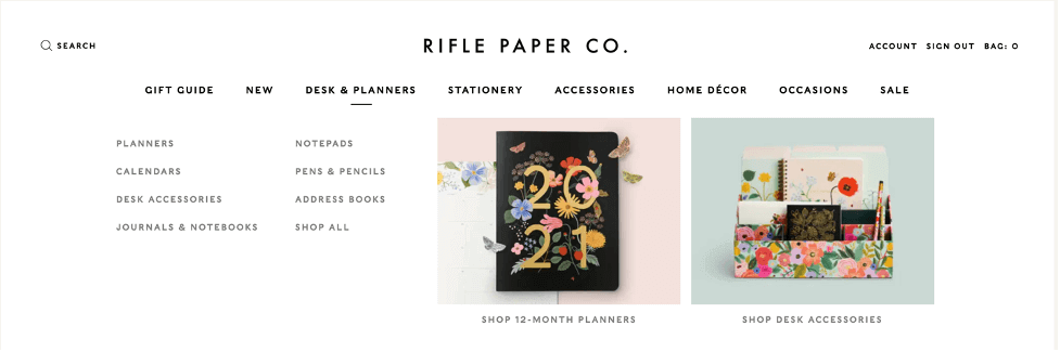
Rifle Paper Co. is a great example to begin with. You’ll notice how the navigation across the top looks pretty standard, but now, when the user hovers over an item, what appears is a much larger menu with secondary navigation tiers as well as images.
2. Thursday Boots.
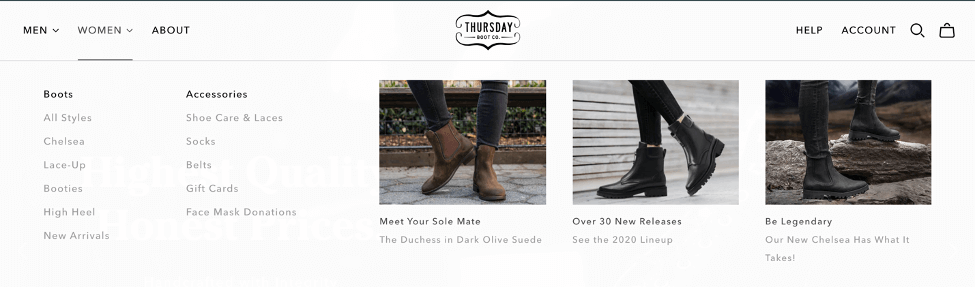
Thursday Boots takes it a step farther. You’ll notice how here they have tiers of categories within the menu, as well as images guiding images to new products.
3. Moleskine.
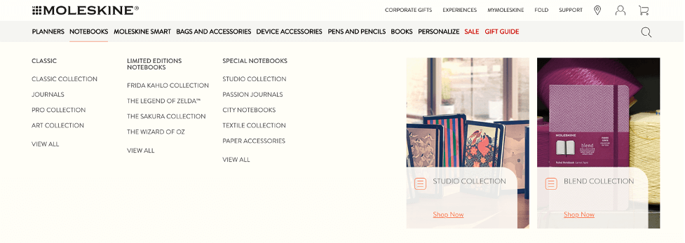
Moleskine really pushes the envelope on how much a mega nav can fit into its space without becoming too crowded. You’ll notice that within the “Notebooks” menu item, there are three categories of notebook products, as well as two collections that are highlighted with images.
4. build/create.

Yes, we’re offering ourselves up as an example of mega nav. Consider it putting our money where our mouth is. Our mega navigation menu was one of our favorite upgrades when we launched our new site, although we only use it on the “Services” menu item. The other navigation items didn’t need a second tier, and this let us add visual hierarchy through icons and navigation headers which we couldn’t do on our old site.
5. Eagle Technologies.
Eagle is another of our sites, which we launched earlier this year. Our use of mega navigation with them allowed us to add a few words of description below each menu item, to guide users to the right portion of the site. This was helpful, given the technical nature of their business.

Mega navs open a new path forward for navigation functionality.
Mega navigation is one more example of why it’s so important to pay attention to new design trends. The Internet is constantly changing, and with each new design innovation, users grow accustomed to more sophisticated experiences. If your website doesn’t keep pace, it will begin to show its age. And if you work with a Michigan web agency that doesn’t keep an eye on these trends, then even your redesign won’t keep pace.
Of course, mega navs aren’t for every website. If you have a relatively small informational site, it won’t be necessary. And even a large ecommerce platform needs to be cautious about adding too many items to its navigation. But for many content rich websites, mega navs are a UX godsend. We’re excited to help more of our clients deliver better experiences to their customers and clients with this design tool.