
How do you design a good user interface for your website?
Do you think of your website in terms of its user interface? Many of us don’t. It’s a place where we put content, share images, upload product information, etc. But the truth is, every part of your website involves user interface design. Menus, icons, buttons, and forms all involve subtle design elements that guide users through your site.
This is a deep topic, and one we’ll return to a lot in the future. But to start, here are some principles of good user interface design that you should think about next time you are evaluating a web design.
1. Don’t make your users figure everything out.
How often do you click on links, buttons, or icons if you don’t know what they do or where they’ll take you? The answer will vary from person to person, but all of us will acknowledge at least some reluctance to do something when we don’t understand the consequences.
From my observation, younger or more confident users tend to more naturally inquisitive. If you’re someone who cut their teeth on the Internet by clicking all the buttons and Googling when you didn’t know the answer, then you’re probably more likely to experiment with a new interface. However, the less familiar someone is with technology the more worried they will be about “breaking” something or doing something they can’t take back. And even the most experienced of us know better than to click on a mysterious, unlabeled link.
In the end, if your users have to conduct a lot of troubleshooting in order to use your interface, you’re not doing your job. Your job isn’t done just because the website “works.” It also has to be usable. When websites aren’t useable, visitors leave and go to ones that are. So don’t hide important elements where they’re hard to find or behind icons that are hard to recognize. Include labels and prompts. Make it easy.
2. Teach your users through feedback.
If your users do click something they’re not supposed to, make sure they can go back. Think about Google Inbox: when you sweep a message aside, they offer an immediate “undo” option in case you cleared that that message by mistake:
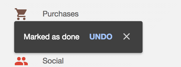
Do you know what doesn’t do that? Outlook. If you’ve ever accidentally deleted an email in outlook and then had to go to the trash and dig it out, you know how frustrating this is.
Similarly, if you have to include an unfamiliar design element, walk your users through its use and provide feedback about what they’ve done. Pablo is a fantastic example of the first. When you first go to use their site, they walk you through as simple, 5-step guide on how to create images.
It’s simple, clean, and intuitive. By the end, the user feels empowered to make their own images. And let me tell you: making your users feel confident is a wonderful way to convert them to your team.
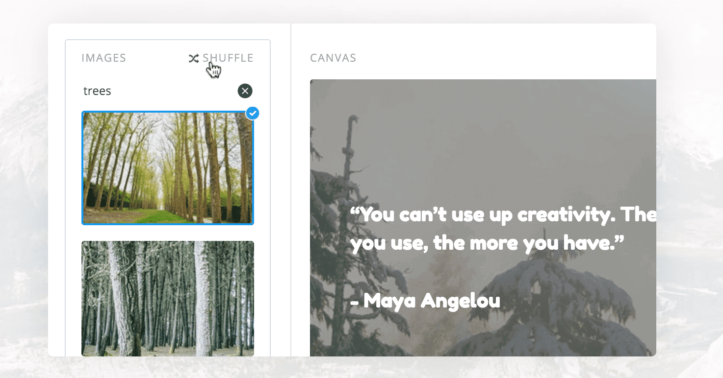
Another one I love? 123rf.com has a simple image editor to help you choose the right images for your project. They include simple design tips whenever it launches to help you make good choices:
That said, feedback doesn’t have to come in the form of explicit instruction. Think about the “message sent” notification when you send an email, or how the Facebook “like” button turns blue when you click on it. They’re such simple visual cues that you only notice when they aren’t there—like when you click “submit” multiple times on a form because you can’t tell if it was sent or not.
3. Set good defaults.
True fact: Most users do not change the default settings. Not on their microwaves, not on their phones, and not on their user accounts. How does that apply to your website?
Let’s say you have notification settings that default by emailing your users about every minor interaction on your website. Sounds irritating, right? Most of your users won’t bother looking digging through your website to find a way to turn those notifications off—they’ll just leave. Or be permanently irritated with you. Either way, it’s not a good look.
That said, you can also use defaults to prompt users toward certain actions. Think about the default profile image in Twitter: it’s a subtle prompt to encourage users to change their image so that they aren’t confused for someone else. The same can be said of many profile elements across social media sites. People who use their accounts take time to customize them, usually because the website prompts them to fill in that information. So if you don’t want users to leave a space blank, remind them to fill it in.
The mistake is yours.
It’s tempting to blame the users when something goes wrong. Why did they click on that? Why didn’t they see that icon? Isn’t it obvious what they’re supposed to do?
You might think that, but then, you have an advantage: you designed the system. You have the answer key. Your users are not so fortunate. They have to work these things out based on the cues you give them, and if they can’t work it out, it’s not their fault—it’s yours.
Go the extra mile to guide your users through your interface. Include prompts in form fields. Draw attention to the buttons you want them to press or the navigation you want them to use. Give them feedback about their actions, and let them undo their mistakes.
Do you need help with a better user interface design on your website?
Let us help. We’re committed to functional design that puts the user first at all times. If this sounds like the kind of website you want for your business, contact us.