
What is white space in web design, and why does it matter for your website?
What’s the difference between a “crowded” or “busy” design, and one which looks “clean,” “fresh,” and “open?” We use these adjectives a lot to talk about web design, but they aren’t very specific. In fact, perhaps one of the reasons many of us have difficulty communicating what we do or don’t like about a design is a result of these emotive adjectives. We know how a design makes us feel, but that feeling could be different for someone else. More to the point, the words you use to describe it can mean something different to someone else. So, to specify these impressions, we’d like to introduce you to the concept of “white space” in web design.
White space, also called “negative space,” refers to any area in your design which you haven’t filled with text, images, or other content. It doesn’t have to be white, although it usually is neutral. It’s one of the most important elements of a good web design, and if your site doesn’t have enough of it you probably have some serious usability issues (which we’ll get to in a moment).
Yet, in spite of this, many website owners look at white space as area they need to “fill.” White space, to them, is a job half done. They perceive “space” as a commodity in short supply, and rather than leave that area be, they want to push more elements into that space—an advertisement, a call-to-action, an image, more text. This point of view makes sense to many coming from a print background, but it has serious repercussions online, where space isn’t nearly so important as how you use it. To understand this, let’s look at some examples of white space in web design to see how and why it works.
Google: the case-in-point for white space in practice
Foremost among white space users online is Google. We’ve all seen their home page, and it would be hard to find a more focused design:
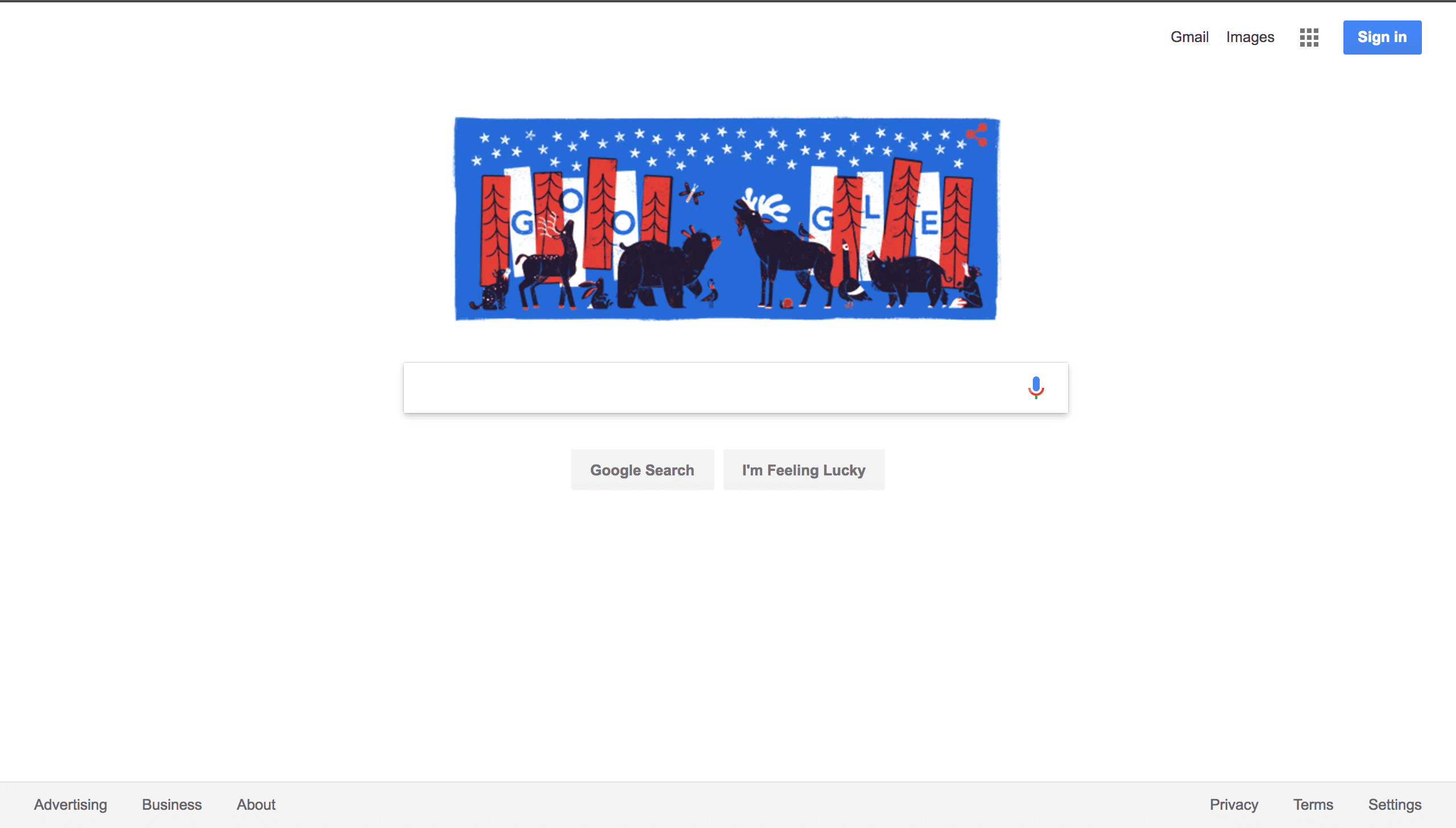
Just look at that white space.
Google knows that almost everyone who lands on that page is there for the search bar. Other than some minimal navigation at the top and bottom of the page, there isn’t much more to do. But that’s the point. If Google wanted you to do something else, they would have created a different landing page to send you there. Like, for instance, this one, for when you want to create a Google account:
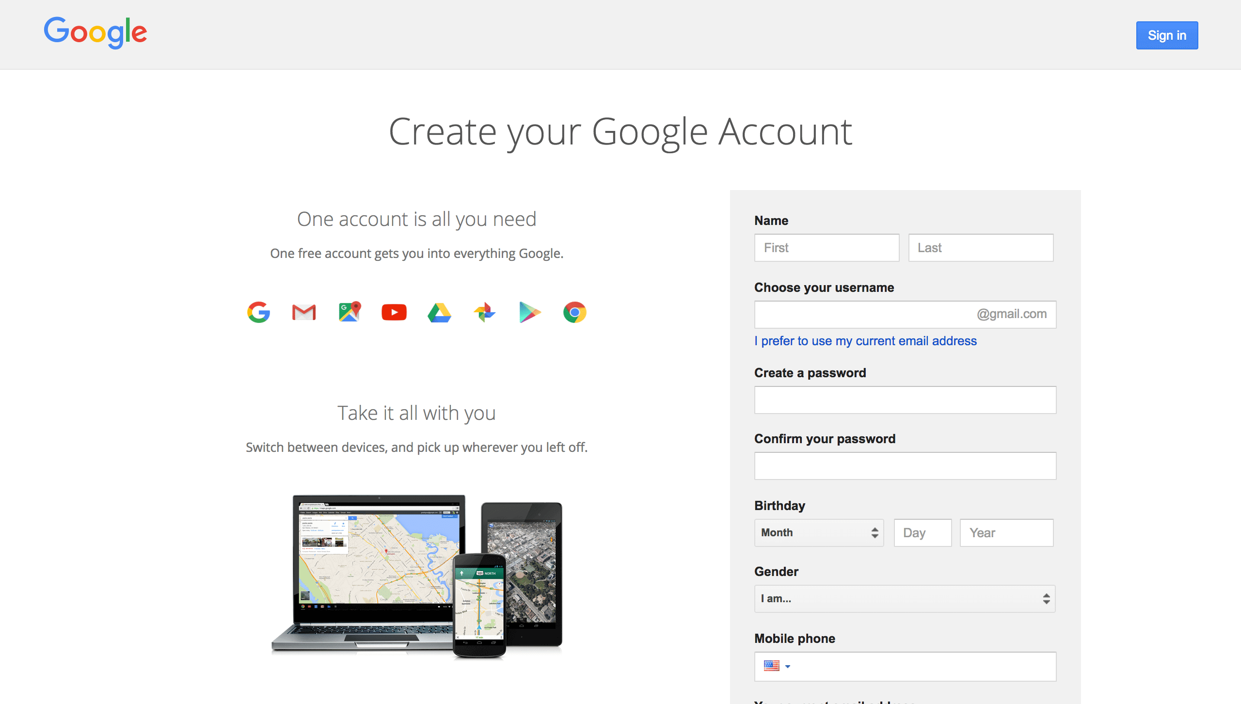
No distractions: just fill out the form.
Here, again, white space is prevalent. This page wants you to do one thing: sign up for Google. And in pursuit of that goal, Google is not risking any distractions. For contrast, let’s take a look at how Yahoo! organizes content.
Why Yahoo! is everything you don’t want your design to be.
I remember first using Yahoo!, probably in about 1998, the same year Google was founded. At the time, it was the search engine. It functioned like an Internet directory, a sort of online equivalent of the yellow pages. Like the yellow pages, it viewed space as a premium. And, like the yellow pages, the past twenty years have made it obsolete. Let’s take a look:
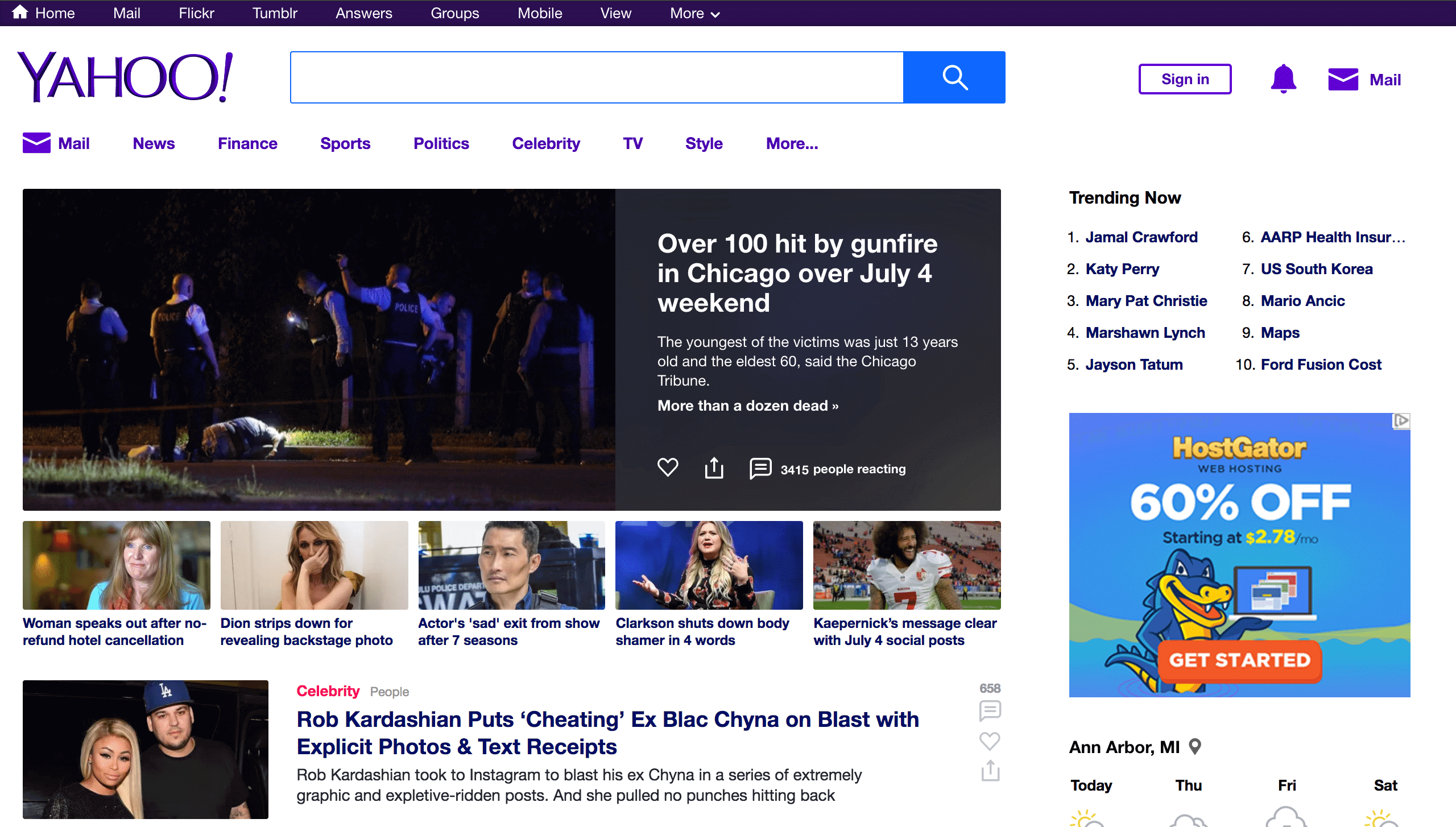
I don’t even know where to look here.
I’m not sure if Yahoo! wants to be a news outlet, an email service, or a search engine. And part of the reason I’m confused is because Yahoo! wants to be all of these things. But because it wants to be all of them equally, I feel pulled toward something other than my original purpose no matter which way I look.
If I came here to use the search engine, I’m distracted by the news headline.
If I came to read the news, the content I want to read is crowded by the search banner, which follows me down the page.
And, if I came to check my email, both of these things are an issue.
Keep scrolling and the results don’t get any better:
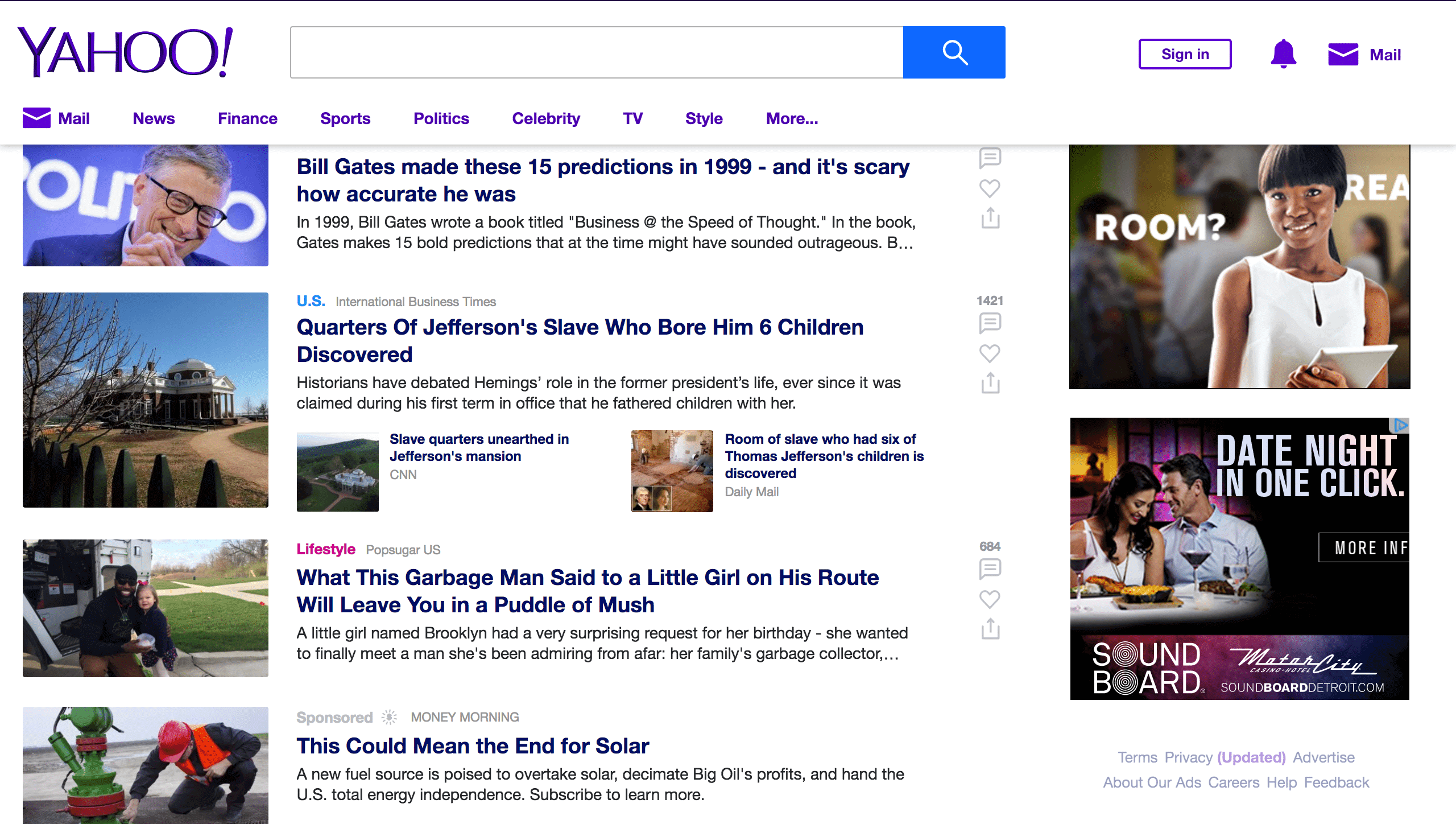
If I didn’t have to write about this, I would have bounced by now.
What went wrong
This design presents three columns, the left a stack of pictures, the middle various news links, and the right advertising. It took me a little while when looking at this to realize that the column of pictures on the left correspond to the news items in the middle. This is partly because there’s the same amount of spacing between the image and its related news item as there is between it and the images above and below. Furthermore, the advertisements on the right look visually similar to the images on the left. Subconsciously, I view it all as advertising and block both out. I find myself trying to ignore everything but the column of text in the middle, and it’s exhausting.
If I were to describe this in emotional words, I would say it felt “cheap,” “crowded,” or “like a Tabloid newspaper.” Which is a shame, because some of those articles may contain some fine journalism. Unfortunately, because of the lack of white space, I have to read carefully to tell if what I’m looking at is worth my time.
Why does white space make web designs work?
White space allows you to organize the information on your website in a clear hierarchy. If you stop to think about it for a moment, you’ll understand why this is. The more elements on the page there are to compete with your attention, the less each individual element can stand out. In the worst scenarios, this can lead to a design arms war, where the competing links, images, and calls-to-action become more and more distracting in a bid to catch your eye.
Need some examples?
Let’s start with this landing page from Warby Parker:
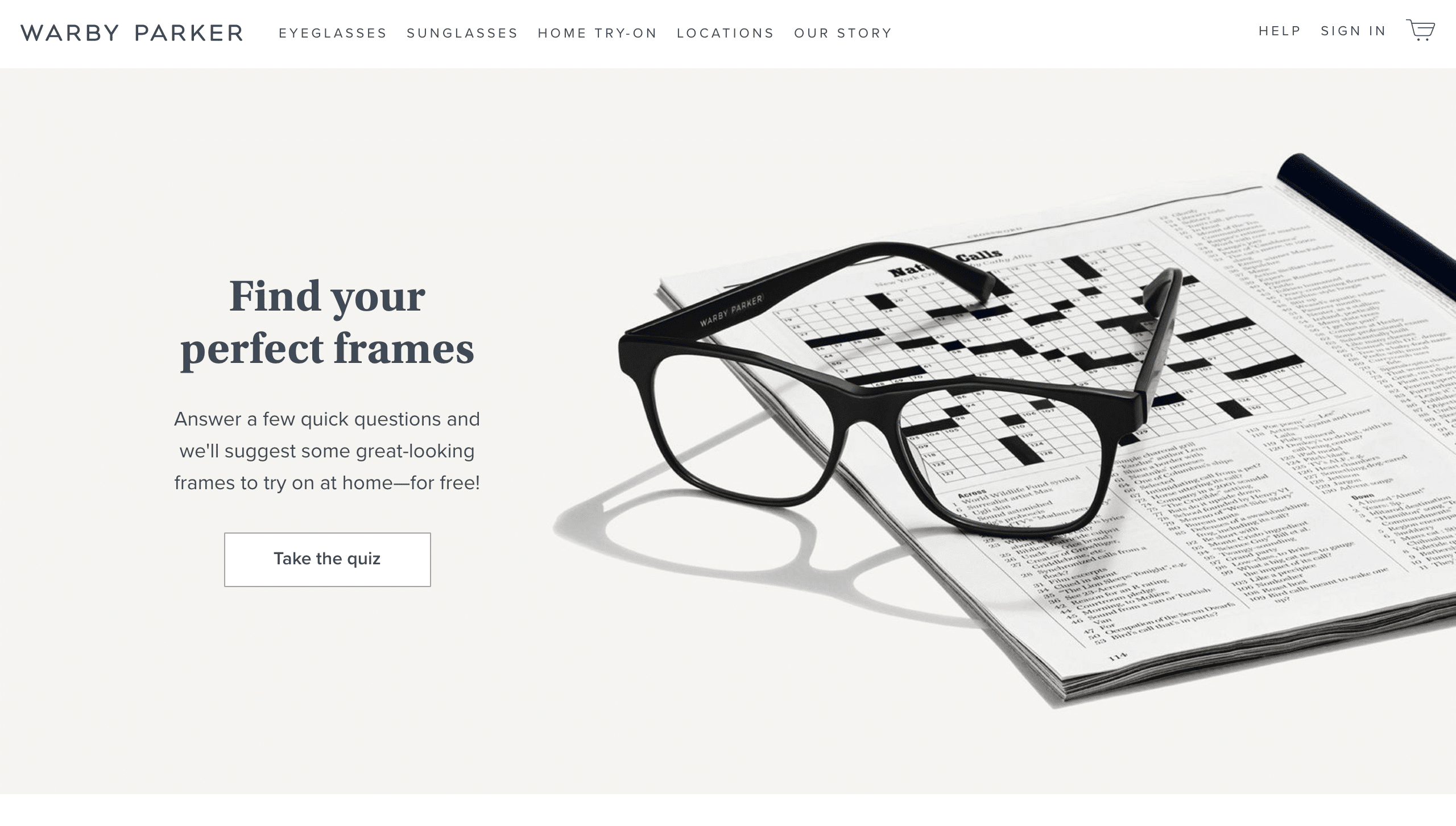
Why yes, I do want the kind of glasses that make me seem like I’m the sort of person to do the Sunday crossword.
The designer here understands the importance of establishing a feel and directing visitors to the CTA right from the beginning. I particularly love the slightly yellowed background that has the feel of an old newspaper, combined with the crossword puzzle. It makes me feel comfortable, like I, too, would want to put on a pair of these glasses and settle back into a lazy Sunday afternoon of word games.
Here’s another one from Apple:
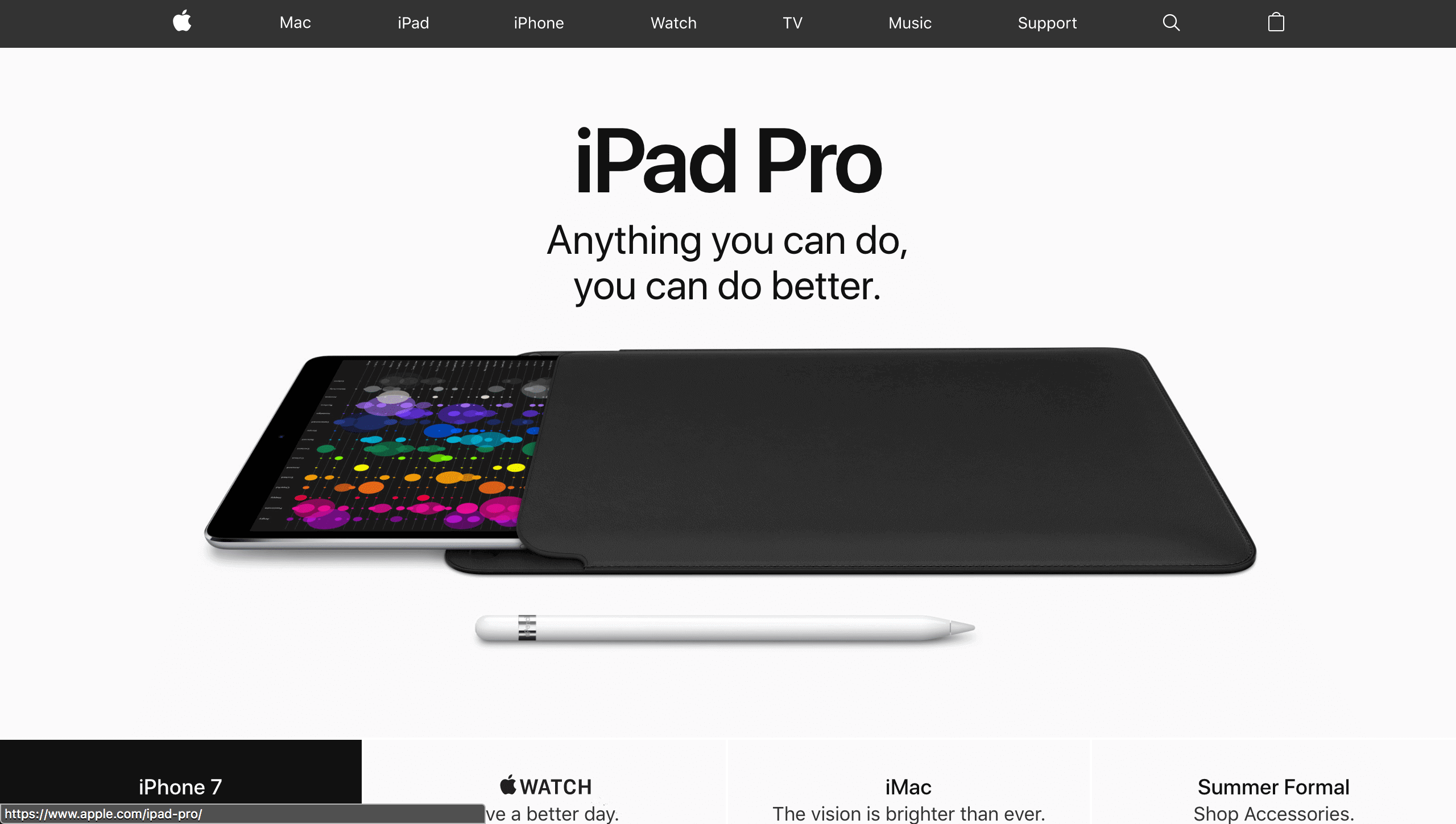
This headline makes me feel so confident and energized.
It should come as no surprise that Apple knows how to use white space to advantage. In this instance, just a hero image of their product and a headline with a clear value proposition. What’s more, they let their copy deliver an unmissable statement: this product will reduce the friction between inspiration and creative output. Squashed amidst a lot of other images, content, and copy, I might not have had enough time to allow those words to sink in. Also, look how Apple zeros in on just one of their products: no rotating slider to draw attention to their entire line. This front page is about the iPad Pro, and nothing else.
Finally, this site:
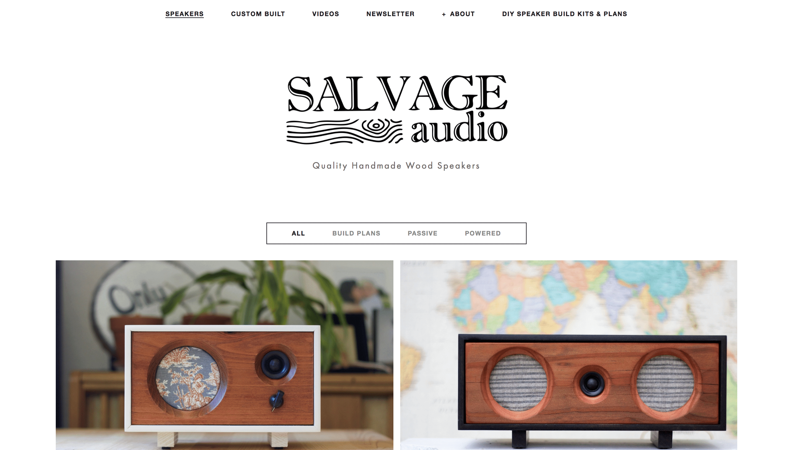
This site hooked me from the first picture.
I stumbled across Salvage Audio while researching another project a little while back, and was totally hooked by the images and videos on the site. I include them here as our “everyman” example: you don’t need to be Google or Apple to get away with using white space to effect. It’s the best friend of any web designer—or any web surfer, for that matter. This site allows the images to speak for themselves, and it gives each one space to stand out. Do you do that on your site?
Include white space in your web design. The Internet will thank you.
White space focuses the attention. It cuts out clutter and broadcasts “THIS IS IMPORTANT” without having to say a thing. This principle extends well beyond the realms of web design. For example, anyone who’s been to a fine dining restaurant, watched enough cooking shows, or browsed images of plated food online recognizes the ways chefs use large plates even for the smallest dishes.

Science shows that the presentation of food affects how much you enjoy it. The same is true for your content.
Whitespace isn’t trendy—it’s timeless. If you want a design that will help your visitors find what they’re looking for, help you convert leads, and help your business succeed, pay attention to how you use white space on your site.
Does your website design need an overhaul? We can help. Contact us to talk about designing a website that works for you, your visitors, and your business.