Every website platform or developer out there has their own set of tools they use to build your site, but here are 5 features that you should get regardless of who makes it. If they don’t, they ought to have a good reason why!

Mobile Friendly Design
This is pretty close to ubiquitous nowadays, but if anyone is trying to sell you a site that isn’t mobile friendly- back away slowly. The average site is pulling in about 25% mobile traffic at this point, and for some businesses it’s even higher!
NOTE: “Mobile Friendly” does not necessarily mean “responsive”- meaning that while your site may have a mobile friendly appearance, it might not scale down as elegantly as one would like. Always ask for portfolio examples!

Form Builder
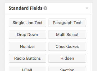
This is another one we see a lot of people not getting right. WuFoo, NinjaForms, etc have very few legitimate usages any more. Why in the world would you want your site visitors going off site, storing your data off site, and not having complete control? Demand a badass on-site form builder! Gravity Forms is what you want. If you’re on WordPress and not using Gravity Forms, you’re getting cheated.

Video Gallery
We get a lot of requests for easily embedding videos, and it boggles my mind because this has always been easy peasy on WordPress! It’s clear that video content is a powerful tool for engagement- we see the results in our analytics every day, so your site better make it easy to do.

Flexible Content Management
This is a big one, because while it’s becoming more and more commonplace, it’s not often done well. We all know how content management has worked in the past, like a giant MS Word document. You move one element and suddenly the entire page explodes. No sexy multi-column layouts, no specialized layout blocks, no easy way to set backgrounds and all that. The abilities are there, and you should expect to see some level of flexibility beyond the MS Word nightmare.

Training
This is a big one. Can someone tell me what good buying a fancy new website is if no one teaches you how to use it? You should expect some level of training included in the project, if it isn’t, ask about it. Is it something extra? I mean, you’re always going to be paying for it, but the question is whether it’s something the company feels is essential enough to bundle into the cost of the website by default. If not, that’s something to watch out for, especially if you plan on having a long term relationship with this company.
An informed client is our best friend
We really like transparency, thats why we write posts like this. When you interview a new developer for your site, they’re going to have a whole different set of practices and features and things they use to ship their product. As a customer, it’s hard to know what to expect, what’s easy vs what is difficult to accomplish. Then when you’re looking at a few different proposals and they all take different approaches and offer different features for different prices, you simply aren’t equipped to make the best decision for your business.
Being an informed client or consumer isn’t about knowing everything, it’s about knowing what you don’t know, and how to ask the right questions. I hope we’ve helped you take a step in that direction, stay tuned for more!