
Want to get rid of your carousel? Here are 6 ways to replace your homepage slider.
We recently laid down some hard truths regarding the utility of homepage sliders. But now that you’re taking them off your page, how should you use that space instead? Happily, there are several great alternatives, which we’ve rounded up (with examples!).
1. Hero image with strong CTA.
This is the go-to for many websites, and for good reason: it looks sharp, is easy to make mobile-friendly, and it converts well. Your hero image should clearly connect to the value you provide through your service, and you should have an obvious call-to-action that will indicate to your visitor the next step in the buying process. 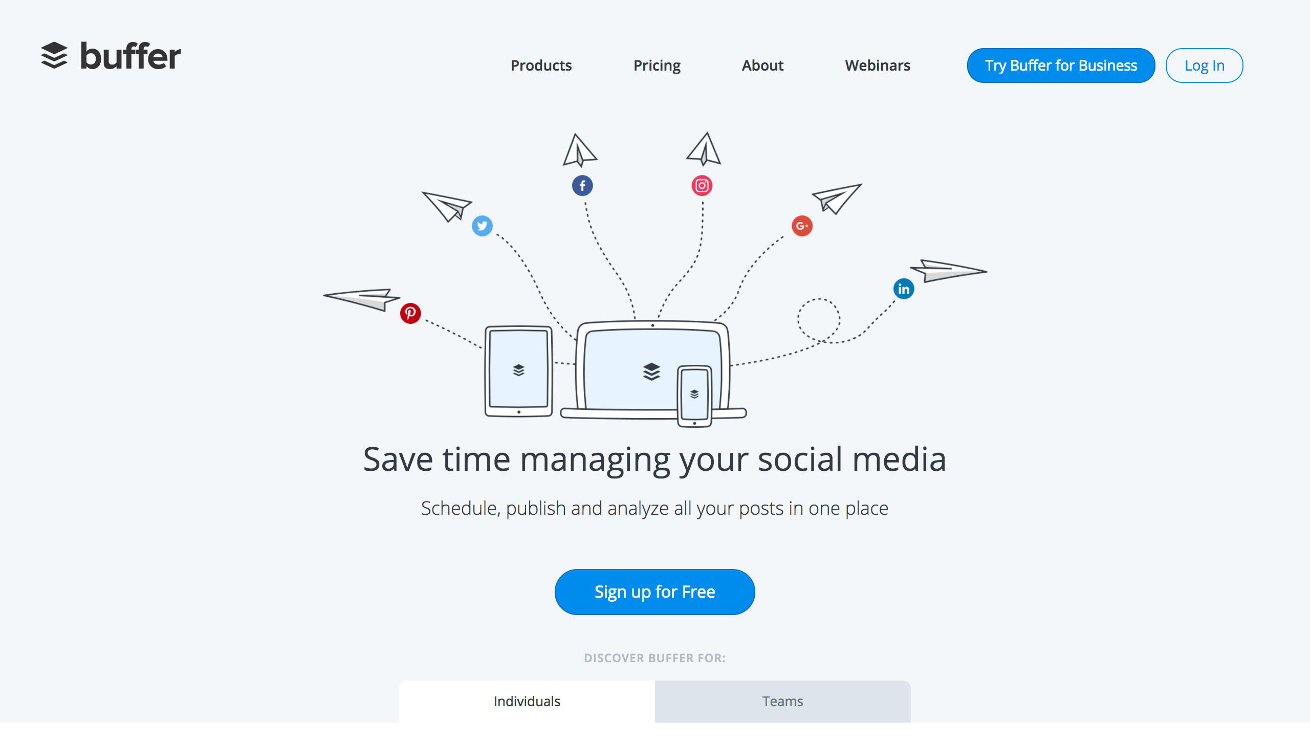
This style is easily the most prevalent on top-performing websites, but we’ve chosen Buffer to illustrate. Their value proposition is front and center, along with a simple subhead elaborating how their tool will achieve its purpose. Sold? Sign up for Free!
2. Above-the-fold video.
I am a big fan of above-the-fold videos. Largely because they’re easy for me to consume, and it’s a concise way for me to understand the key selling points of a product or service. If you’ve already produced a product video but you have it further down the page, consider moving it up the page and combining it with your hero image and CTA.
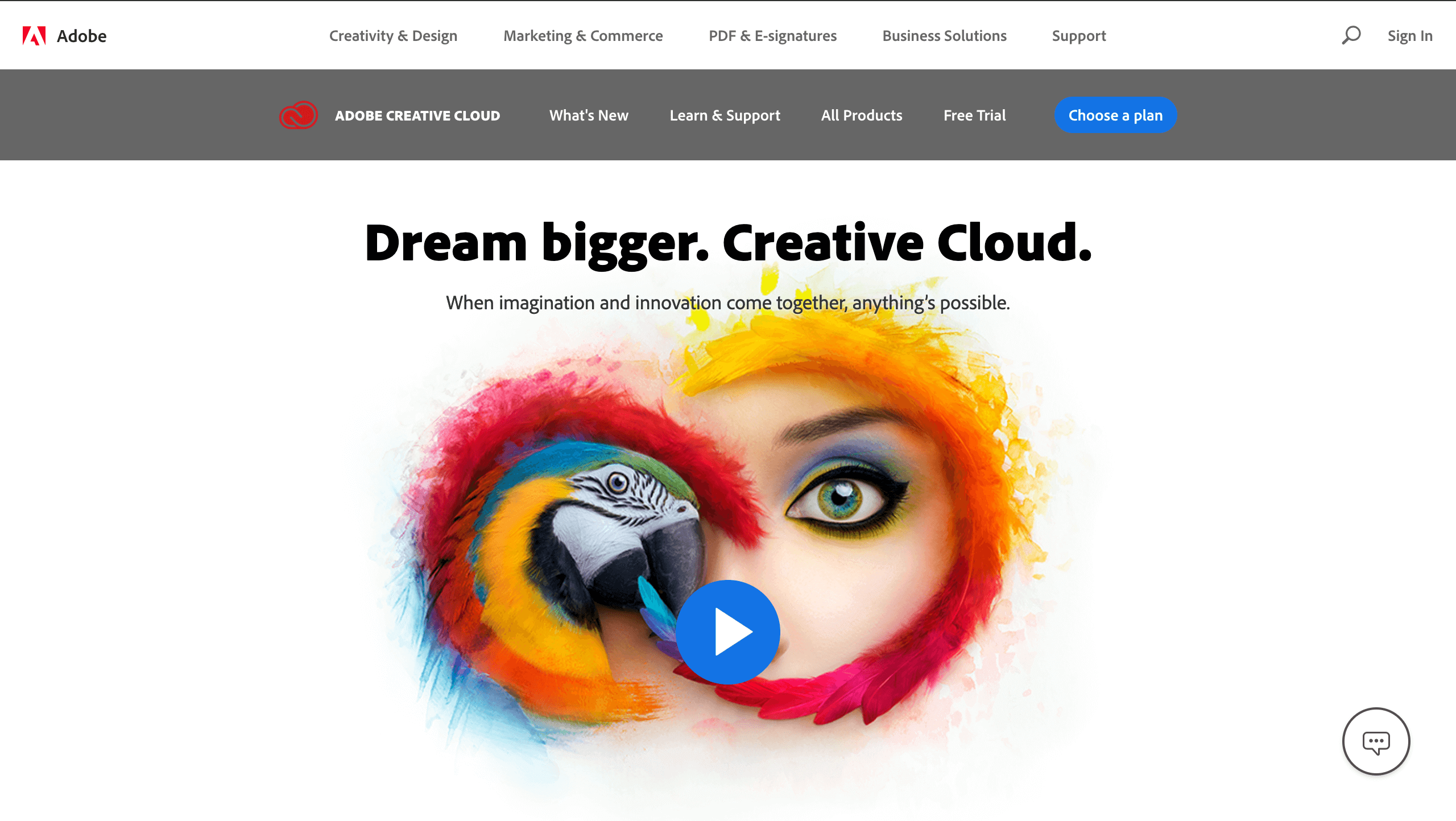
Notice how Adobe puts their product video front and center, giving users an immediate and compelling reason to learn more about their product. It’s a great way to use the space in a way that doesn’t overwhelm the user with too many options.
3. Sign-up Form.
Why not cut straight to the point? If you need someone to sign-up in order to make the most of your service, don’t put any barriers in their way. Include other selling points for those who need convincing below the fold.
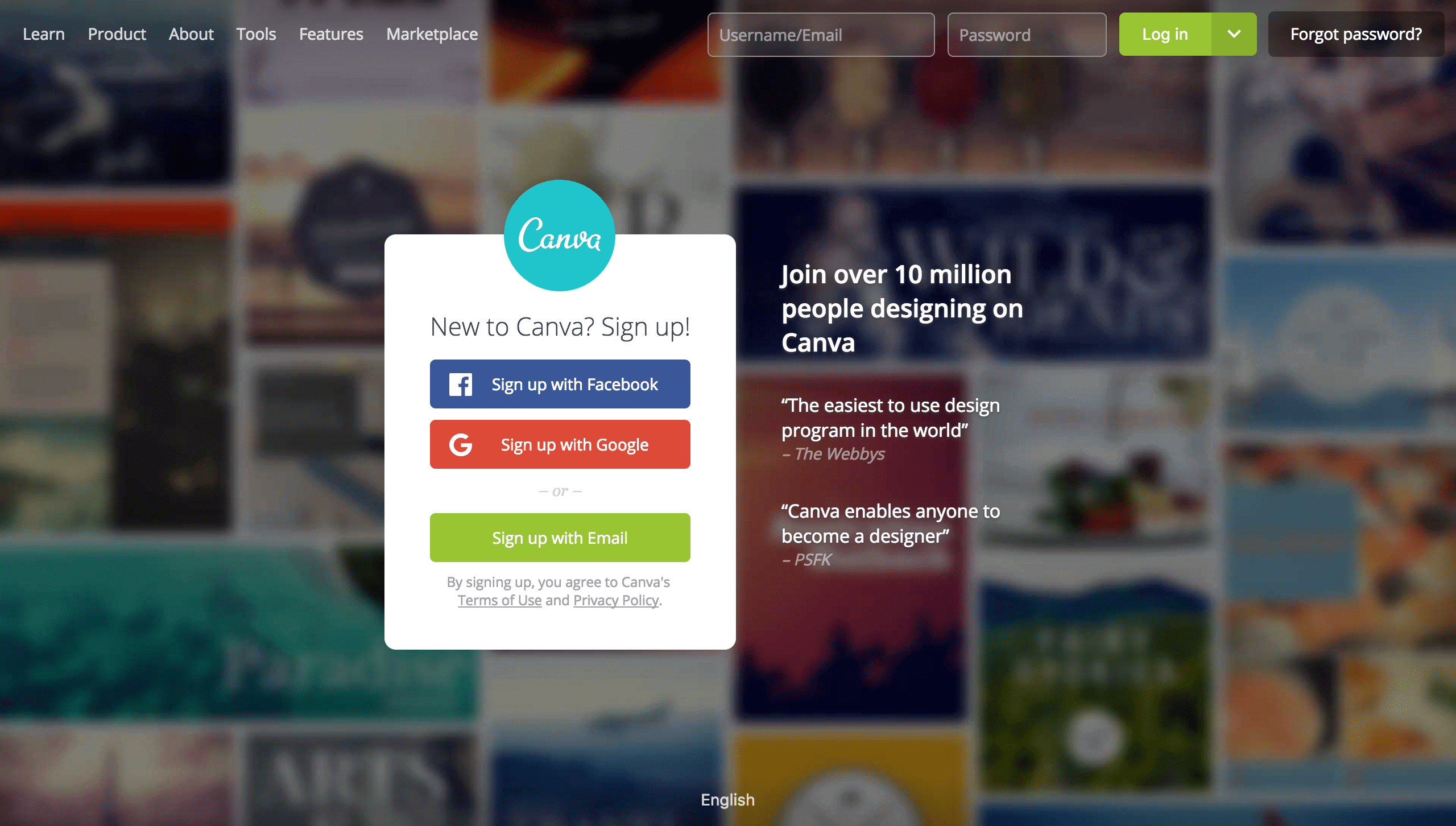
Canva does this well, combining their sign-up form with a mouse-tracking design feature that’s more than a little mesmerizing. (The blur effect disappears as you move over the background, revealing the kind of designs Canva allows you to make using their tool.) While there’s a navigation bar at the top, the sole focus of the home page is the sign-up form. The headline and quotes provide the motivation and social proof to convince uncertain buyers.
4. Background video loop with static CTA.
This can work, but tread with care: a video loop that moves too quickly can be disorienting. It can also add some unnecessary load time to your homepage, slowing down your site and potentially losing you visitors. But, if handled with care they can be a subtle and pleasing take that gives your home page a modern feel. These work best if you have to create a mood or want to show off something visual.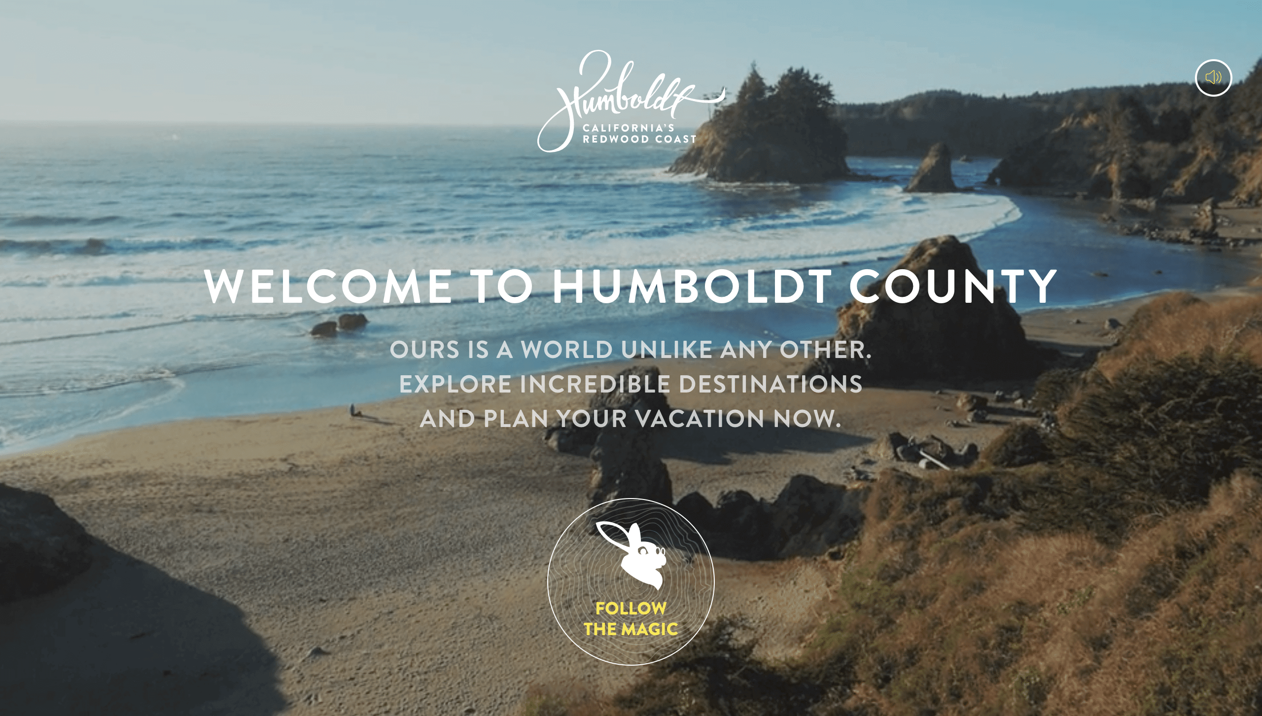
A great example of this done well is the tourism website for Humbolt County, CA. Home of redwood forests and some truly breathtaking scenery, they don’t shy away from showing this off in their background video. It also manages to set an “Alice in Wonderland” environment in the space of about 40 seconds. Notice how the video doesn’t prevent you from being able to read the text or leave you feeling overwhelmed.
5. The Grid.
Think Pinterest. If you have a product to offer—clothing, furniture, food, accessories—you probably want to show it off. Instead of using a slider, which takes control away from the user and sweeps potential items of interest away before they get a close look, try a grid view. This is also popular among designers and news outlets for its ability to present a broad portfolio or multiple news stories in a neat and orderly fashion.
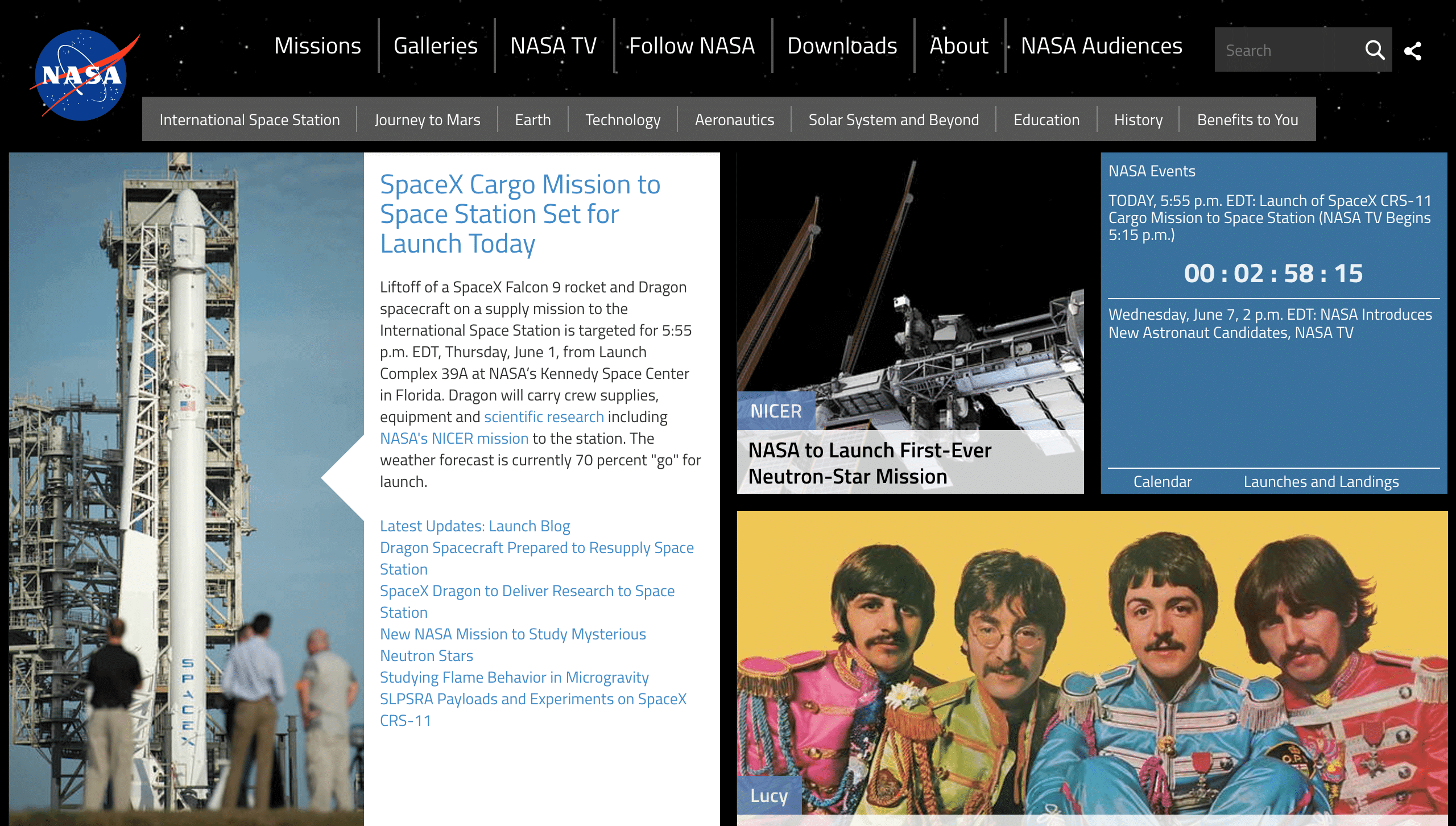
We’re pleased to offer up NASA as an example of this style done well. While multiple items can be overwhelming in some contexts, it works well to provide news items or different stories. This also works well for blog pages, if you want to promote several different topics or popular posts, rather than the most recent.
6. Buckets.
Usually we want to keep the above-the-fold CTAs to a minimum—preferably just one. But sometimes you have two very distinct personas or service offerings, and you want your visitors to easily sort themselves into the right category. After all, this will help them find what they’re looking for, and it will help you better direct them to what they need.
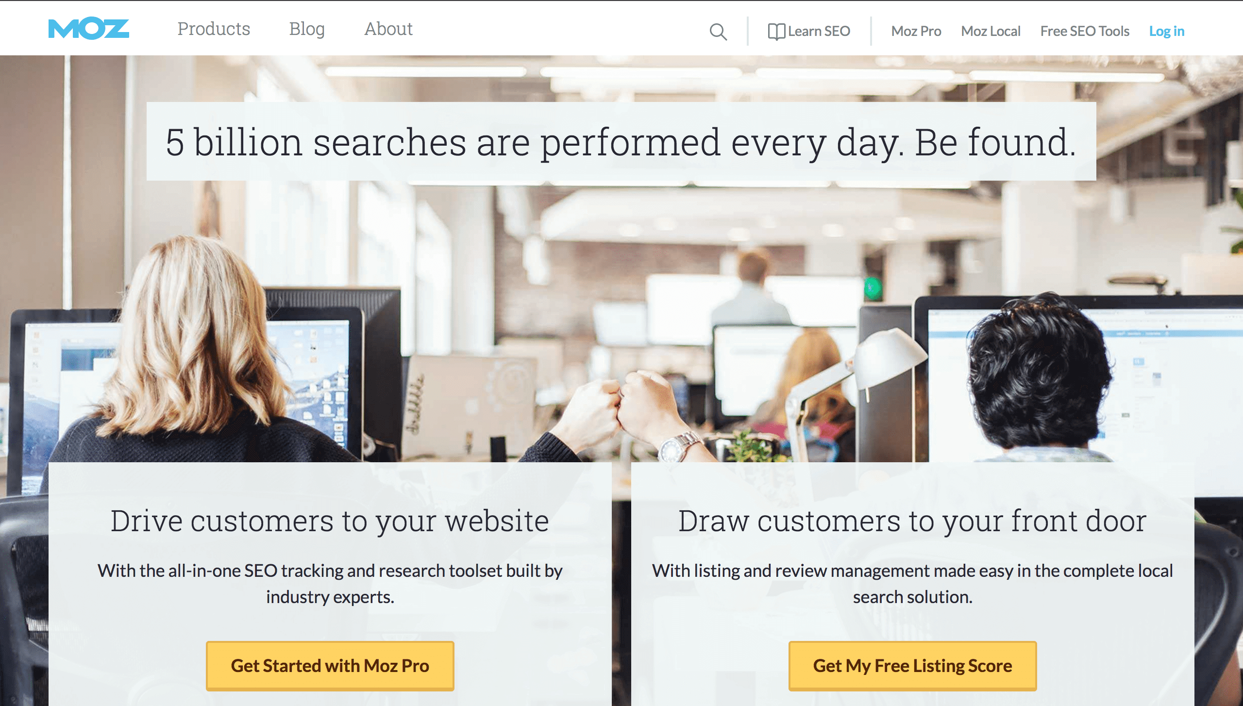
You can see this in action on Moz’s home page. They combine a hero image and header with two CTAs, each targeting one of Moz’s top offerings. The layout is simple, making it easier for visitors to quickly chose which door to go through. Your visitors don’t want to have to work hard to decide where to go. This makes the choice as straightforward as possible.
Keep testing.
Our main objections to using an above-the-fold homepage carousel are its poor user experience and low conversion rate. So it would be counterproductive to recommend alternatives unless they worked well. Not every alternative will work for every business, and there are many ways to use almost all of these poorly. As with all your home pages, always test them to be sure that any changes you make work well. If you try something and notice a difference in your conversion rate, take note of the different factors involved and try to isolate the variable responsible for the change. Then keep testing, one element at a time, to find what works best for you. At the end of the day, the best design is the one that works.