We did a review of the marketing email turning up in our inbox and compiled a list of key takeaways based on which emails we determined were more effective. Here’s what we learned.
Most of us, if we’re being honest, have a love/hate relationship with the marketing emails that find their way into our inbox. Nine times out of ten, that relationship tilts more to the “hate” side of the scale, but there are always those few emails that catch our eye, that deliver value, that we maybe even look forward to because they’re giving us something we want in a thoughtful or interesting way.
If you’re in marketing, you’re probably also painfully aware of how much your own emails fail to fall into that second category. We all want to believe that the emails we send out are eagerly received in every inbox, but then we look at our open rates and face the cold hard reality of how many of them end up in the trash folder unread.
Well, we’re here to tell you two things. First: a better marketing email is within your reach. And second: your open rate matters far less than how the people who do read your emails respond to what’s inside. For those readers, the design decisions you make will go a long way toward establishing credibility with them, providing an enjoyable experience, and earning an ongoing place in their inbox.
Of course, email marketing has evolved a lot over the years as email inboxes have become more sophisticated. We decided it was high time we took a look at the latest best practices (as determined by our own observations of what worked and what didn’t). Here’s what we discovered.
1. Make each section feel thoughtful and interesting.
If you want your readers to give your content the attention it deserves, then you have to design each section like you mean it. For an email that features multiple sections, give each one some flavor and a headline of its own so it feels like its own little postcard.
2. Tailor CTA buttons to the content.
The golden rule of a CTA button is that it should complete the sentence “I want to…”. But there’s a lot more you can do with that button text than the generic “learn more,” “register now,” or “read more.” Some of our favorite examples used carefully tailored language for buttons—phrases such as “Get going,” “Create Impact,” or “Make Connections”—that matched the content of the newsletter itself.
3. Be intentional with copy.
Headlines and subheads do a lot of heavy work in most marketing emails, which feature only light body text. Some of the poorer examples we came across felt overburdened by copy. The problem wasn’t long copy itself, but the way excess copy expected the reader to make decisions.
There is a place for long copy in an email if it’s coming from a trusted sender who has valuable things to say. In fact, long copy is sometimes overlooked, because when it’s done well we don’t notice the length at all. But this copy only really works if it’s coming from a person rather than a corporation. The more readers feel like the copy was written to them from a familiar face, the longer they’ll stick with it.
4. Keep the focus clear—don’t turn your emails into a dumping ground.
You know when emails start to feel like a slog? When they have so many different things going on that they feel like a scatter shot of intents and paths. It is hard to establish sufficient buy-in from your readers if they can’t easily tell what your email is about. Instead, establish the focus with a big headline or bold imagery, and commit to that idea. Save your other ideas for another email—they’ll keep.
5. Choose one value proposition for one product, or one storyline for multiple products.
Similar to the above point, don’t overwhelm readers with a laundry list of products and value propositions. It’s great that you have a lot to talk about, but you need to let your readers digest one thing at a time. If your email is about a specific product, that means one value proposition. If you’re offering multiple products, choose a storyline that connects them all—and then tell that story.
6. Use clever interplay of image and color.
Imagery and color working together are often the first elements we notice in a good design, and this holds true for email. Expansive imagery, clever cutouts, or color choices that evoke a specific mood all help an email stand out from the pile. Some color choices currently trending rely on either soft and soothing palettes with tans and blues and warm tones, or bold color and contrast.
7. Mix product photos AND marketing photos.
The type of imagery matters as much as its placement. When emails use only plain stock images with little customization, or when they rely too much on cutout product photos, it makes the email seem stale. Instead, combine product photos with marketing photos, and put a little custom graphic work behind them to make them pop.
8. Give your design room to breathe.
Finally, so much of good design rests on giving elements enough space to be seen and appreciated on their own merits rather than crowded together. Good emails had a lot of padding, and they didn’t let the lines of text get as wide as you might see on a normal text email. Wide lines of text are harder to read than short ones, making them more difficult to scan. Center-aligned body text is also hard to read quickly, so it’s better to keep body text aligned left, which is the most natural reading direction for English language emails.
Examples of email marketing done well.
It’s one thing to talk about the dos and don’ts, but it’s another thing to see it with your own eyes. So, now that you know what to look for, here are some of the stand-out examples we unearthed from our own research.
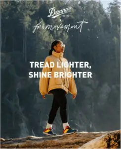
Danner. Excellent example of image and message being front and center along with a tasteful product feature.
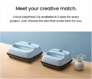
Cricut. The big blocks through the email dividing things up with headlines and subheads make for easy scannability.
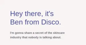
Disco. Simple and warm text-based email—the perfect soft colors, so even though it’s super plain, it just feels cozy and not cheap.
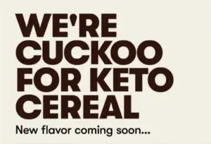
Perfect Keto. The big typography product announcement style works great here, though the big text and THEN the image with button feels like double vision.

Trello. This works really well as a blog feed, particularly how the buttons for each post feature a different CTA that matches the blog post.
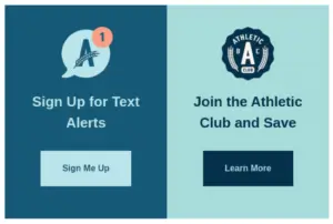
Athletic Brewing. There’s a lot to love here: the end-of-email CTA, the two-column setup, and the way the color scheme really reinforces the imagery and brand.
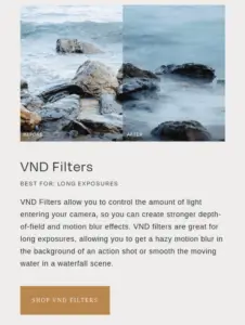
Moment. The useful content within this email is next-level. It shows comparison images between camera lens filters and links to the products in their store. Educating and prequalifying within the email? Not too shabs.
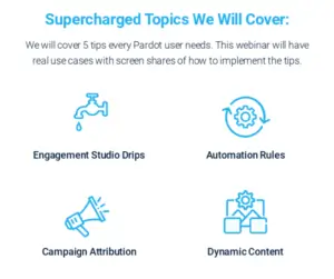
Sales Lab. Good CTA, and the simple icon/titles for the topics instead of building out a larger/longer email is great.
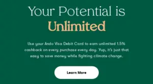
Ando (and a bonus). This demonstrates beautiful use of colors, especially the cards in the first example.
Rock Candy Media (and a bonus). An agency showing off their work, and the bravado is legit!
Indeed. Each section has its own purpose and flair, which makes going through the email feel interesting and less of a chore.
Keep an eye out for our own redesigned emails, coming soon to an inbox near you.
Like so much of our work, this deep dive into email design had a purpose: we wanted to redesign our own marketing emails, and used this opportunity to conduct a mini CLA to guide our work. Coming soon, we’ll be relaunching our marketing newsletter, which will feature industry-leading advice as well as practical tips, tricks, and how-tos from our team. We hope you’ll subscribe to stay on top of the latest, and we promise to make every dispatch worth the read.