How do I make sure my top-tier menu items don’t get passed over?
We’ve talked about approaching your site content from a user-friendly perspective, and we’ve done a walk-through of how to update your menus. But what about some of your stickier menu structure problems?
We decided to address a common problem that many of our users have when they set out to organize their site content.

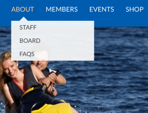
“About” is its own page, but in danger of being overlooked.
Redundant Navigation
Your top-level navigation items are likely to be your most important pages, but they are at risk of being overlooked by 2nd tier navigation items if your users don’t realize they’re clickable.
Maybe you’ve noticed this problem before:
Your top-level navigation items include “home,” “about,” “members,” etc. On most of these, when a user hovers over them, a drop-down menu appears. This is your 2nd tier of navigation. The problem is that many users can become blind to the clickable navigation item in your top tier, and could pass on to 2nd-tier pages without realizing they’ve missed anything.

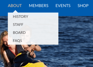
“About” and “History” both navigate to the same page.
How do you keep this from happening?
Or solution is pretty straightforward. If you have a page you want to be sure your users won’t miss, simply add it to the top of your 2nd-tier menu. To avoid having an obviously redundant name, we suggest renaming the navigation item to something synonymous with its top-tier counterpart.
(For a review of how to change menu names, review our post on Editing your Menu Structure.)
As you can see on the left, “About” appears in the top-tier of navigation, and “Our Mission” appears directly under it in the 2nd tier. Both of these simply link to the “About” page on your site.
Have any questions? We’re happy to help you discover solutions. Drop us a line!