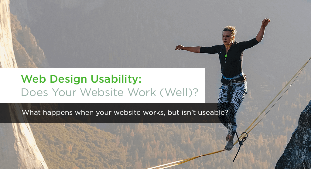
What happens when your website works, but isn’t useable?
How much do you prioritize web design usability for your business? Have you decided that, as long as your website works for you, it’s good enough for your customers? Or are you truly dedicated to creating the best user experience for your website?
Web design usability should be a critical concern or any web development agency and any business interested in building a new website. Not only does low usability look unprofessional, it costs you money. Poor usability leads to high user error and a greater burden on your customer service department. It causes visitors to leave your website in frustration, or otherwise fail to convert.
Your design can’t just be functional; it must be frictionless.
A couple years ago, my health care provider messed up my automated billing. Over the course of correcting the problem, I made three or four calls over several months to their customer service department. While their customer service was very helpful, I shouldn’t have ever had to call them in the first place, because almost every call involved a usability issue on their website.
At one point, to find my billing history, the customer service rep directed me toward a mostly-hidden link in a side navigation menu, which led me to a form page. The rep then told me to leave the form blank, and just hit “submit.” It should go without saying that this was a ridiculous and non-obvious solution to a standard piece of site functionality. The fact that it required a call to customer service was a waste of both my time and theirs.
By the time I finally sorted out my billing situation, I had an extensive list of usability complaints. I mentioned this to my customer service rep, who enthusiastically directed me to a feedback page. Apparently, the customer service department had their own list of complaints, and was eager for customer feedback to validate them. I sent my list, and the next time I returned to the website (a year later), every one of my complaints had been fixed. I would have called customer service to thank them, but I didn’t have to talk to them anymore, which was the point.
In a technical sense, this website worked. You could use it, if you knew how. But from a user standpoint, it was completely dysfunctional. This posed needless and counterproductive barriers-to-entry for users. The same can be said of many other websites. Using your website should be easy. If it’s not, it doesn’t work.
Usability = Design + Development
Creating a usable website relies on the perfect marriage of design and development. Your designers need to know how websites are built so that they can create web designs that your developers can build. And your developers need to understand that usability goes beyond mere functionality. In short, usability isn’t about aesthetic or function, but about behavior.
On a subconscious level, your design and the various functions on your website should be predictable. This means that actions yield consistent results. As a user, I can predict that clicking on a link will take me to a new page, or that hovering over a main navigation menu will open an secondary dropdown menu. I can’t predict that submitting a blank form will give me the information I want.
There are easy ways to address most predictability issues. A line or two of instructions can clarify an otherwise confusing form. Visual cues, such as an arrow, or a link that changes color, can indicate to users what they should click on. If it takes too many pages for your users to complete a purchase, streamline the process. Or, if certain critical pages are difficult to find, make them more prominent.
In an ideal world, these solutions would be simple. However, sometimes simplicity isn’t possible. So if you have to rely on a complex solution, make it easy for your user to navigate. Keep actions consistent, and spell out the next steps.
When good enough isn’t good enough.
In the web development and content marketing world, we often put a higher priority on timeliness of delivery than on perfection. This isn’t a bad mindset. In many ways, you need to get your website (or your content marketing strategy) out into the real world where it can begin gathering user data. After all, we can only perfect our product when we understand how people are using it. Otherwise it’s just guesswork.
But this mindset can contradict good web design usability practices if it causes you to ship a clunky, hard-to-use product. Our years of web design experience have taught us were to look for common usability errors. As a result, we can predict and forestall the most common problems. So how can you decide if a product has met the right quality standards to ship, or if it needs additional work? We offer up these guidelines:
- If you have a problem and you know the solution, fix it.
- If there’s any chance the user won’t know what to do, add directions.
- When in doubt, test.
Having a beautiful, user-friendly website isn’t a pipe dream—it’s a basic requirement of any well-designed and well-developed site. We’ve seen many businesses obsess over which stock photos to use, or how to write their bio copy, all while the much more pressing needs of their end user. Put your user first.
Interested in making web design usability a priority for your business?
Want a usable website? One that does more than the bare minimum, but actually makes your visitors happy? We’re here to help. Contact us today or download our website purchasing guide to get started.
