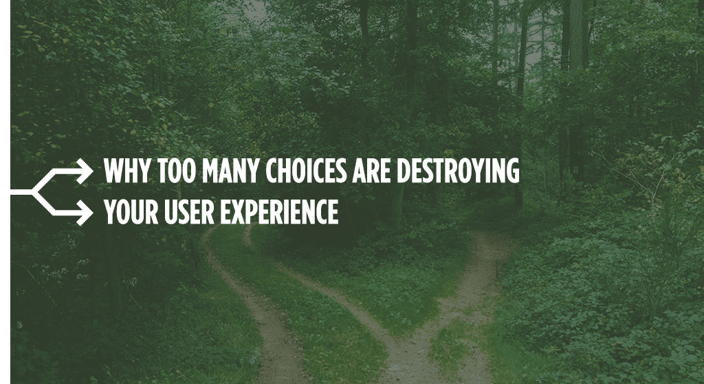
Decisions are exhausting. Give your users a break by designing with authority.
What can grocery shopping tell us about user experience? Like any customer experience: a lot. I usually shop at either Trader Joe’s or Kroger. As much as I love Trader Joe’s, there are a few items they don’t stock. And from bouncing between the two stores, I’ve begun to compare my experience.
What I’ve noticed is that trips to Trader Joe’s are usually much faster, and I have a lot more energy when I leave the store. Conversely, trips to Kroger take a lot longer, and usually leave me feeling exhausted. Why?
I had a clue the other day while standing in the aisle at Kroger, looking at an overwhelming variety of olive oils on the shelf. Should I get the cheapest bottle? The fancy one with the elegant jar? The one in the tin can? How much was price really an indicator of quality? Should I try to choose one that would have a strong taste, or would that affect my cooking too much?
Eventually I grabbed a bottle and walked away, but not without some lingering doubts. Overall, the wide selection of olive oil on display made me feel unhappy and uncertain. And I wouldn’t even consider myself someone who is overly concerned about the quality of my olive oil. I would just have been happy with two or three choices (good, better, best). I didn’t need twenty.
A few minutes later, while staring foggily at a shelf of tea, faced with yet another unexpected slew of options, it occurred to me that one of the great joys of shopping at Trader Joe’s is how fewer choices I have to contend with. Not only did lesser variety lead to a smaller store (navigating only four or five aisles is part of why I can get in and out in less than half an hour), it also lead to fewer decisions—and less regret.
Many of us are eager to offer any number of choices to visitors when they come to our websites. But the reality is that too many choices can be exhausting. So, instead of creating a design smorgasbord, here’s how to relieve your users of some of their decision-making responsibilities.
Be clear.
Use descriptive navigation. One of the main reasons I argue against playful navigation titles is that they confuse users. Your don’t want visitors to your site not clicking on your services page because you labeled it “offerings” and now they think it’s a donations page. Your navigation is your website’s table of contents. Treat it that way.
Label your CTA buttons. They shouldn’t just say “click here.” That doesn’t tell the user where the button will take them or what it will do. Is it going to direct the off their current page? (What if they don’t want to leave?) Or will it start downloading a PDF? (What if they don’t want one?) Instead, use meaningful copy that describes what the button will do.
Use keywords. Keywords aren’t just about SEO. They’re about helping your user find what they need. Like what we said about descriptive navigation, your keywords help reassure your visitors that they are in the right place.
Offer guidance.
Many sites fail to structure their sites toward any specific goal. Their front page looks like a newsletter, or provides a lot of information without a direct call to action. They assume a knowledge level that the visitor may not possess, and forget that in many ways, their users don’t know what they don’t know.
We talk a lot about the buyer’s journey. It comes in various forms, but a quick breakdown looks like this:
0. Unaware: I may or may not know that something is wrong or that things could be better.
1. Pain aware: I know what my problem is, but I don’t know how to solve it.
2. Solution aware: I know how to solve my problem, but I don’t know what my options are.
3. Brand aware: I know who the competitors on the market are and can weigh them against each other.
4. Most aware: I have gathered the information I need and am ready to make a purchase.
As your visitors grow in awareness, they will need your guidance less and less. However, imagine someone landing on your site who is in one of those early buying stages. An information overload will not help them. They may not know enough to decide where to go next on your site. And when your visitors don’t know what to do, they leave.
You don’t need to restrict your user options so much that they can’t find what they’re looking for. But you should present a clear path for the unaware or pain aware to learn about the value your business can bring them.
Be the expert.
We’ve all heard the saying “the customer is always right.” Most of us also know how wrong customers can be. However, it’s not always the customer’s fault. As we said earlier: the customer doesn’t know what they don’t know.
We’re all about putting the user first. But for many users, putting them first means helping them decide. It means providing expert counsel, narrowing their options, and giving a recommendation.
When you don’t provide this guidance, it’s up to your visitors to be the experts, even if they don’t want to be. And if your visitors have to make ill-informed decisions on their own, they’re more likely to second-guess themselves.
We already talked about the visitor path. But think about other ways you can help visitors choose. You could:
Highlight the most popular/best value option. Tagging your options can help visitors see which ones they identify with. Other tags might include the “personal plan,” the “business plan,” or the “enterprise plan.”
Get rid of bad choices. Don’t offer services that you don’t want to provide, or which you know won’t serve your customer. There’s a reason why we limited our hosting options a few years ago: our customers either didn’t know enough to make a good hosting choice, or were insisting on self-hosting. Part of being the expert in our field meant saying: no, we’re not going to do that for you. Most of our customers like this approach, and it helped us avoid some potentially bad client relationships.
Filter options. If you offer a wide range of products, you may save your visitors some trouble by asking a few questions up front and then filtering results. Let’s say you offer skin care products: if you ask your visitors about their skin, you could then offer them a more targeted selection of products. They may need to make a few decisions up front, but it will save them in the long run.
Create a rule of thumb.
A few weeks back, I ordered fish at a restaurant and then asked the waiter if she could suggest a white wine that might go with it. Surprisingly, the waiter’s response was to inform me that the “reds are for red meat whites are for white meat” rule no longer applied, and I could order a red wine to go with my fish if I wanted. I didn’t want a red wine; I wanted a white. More importantly, I didn’t want my decision to be harder than it already was.
I’m no wine aficionado. If I have to pick for myself, I’m likely to make a mistake. So I asked the waiter to suggest something that would go with my dinner, and she obliged, and I was very happy with her recommendation. But I also realized that I would probably never get over the old rule of thumb about picking wines with dinner. It’s just so much easier to choose from just the reds, and even a semi-informed decision feels more reassuring than nothing at all.
Going back to my olive oil conundrum from earlier, what if there had been a tag on the shelf saying: “best for cooking,” or “best for salads?” That would certainly have made my decision easier.
Less is more.
You can’t get rid of all your user choices. After all, some choices are enjoyable if they allow a user to customize a product to better suit their needs. But at the same time, you should be careful about burdening your users with too many choices.
Instead, you use your web design to curate a user experience. You should be prepared to speak authoritatively in your customers’ best interest. You should inform, guide, and delight.
Trust us—your customers will thank you.