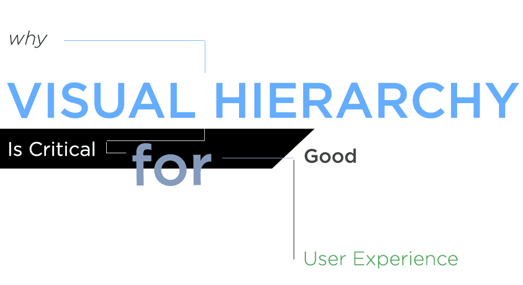
How to create visual hierarchy in web design for better reader engagement.
Have you ever looked at a web page and felt completely lost? All the different elements compete for your attention such that you can’t distinguish the wheat from the chaff. You know the information you need is in there somewhere, but you can’t quite find it.
Conversely, some web pages seem to instantly click into place. They feel structured, harmonious, approachable. You can readily absorb important information or skim past parts that aren’t relevant to your needs. You don’t have to think.
The difference between these two pages is that one has incorporated visual hierarchy into the design, and the other hasn’t. Web designs with poor visual hierarchy feel overwhelming, because their structure doesn’t train the eye where to go. Your website needs visual hierarchy to do its job.
Visual hierarchy establishes priorities for the user.
How often have you seen an article or a blog post with a “top ten” title and glanced down it to find the answers without reading the article all the way through? I’ll bet almost every person to ever pick up “7 Habits of Highly Effective People” has skimmed through the chapter listing to find out what the seven habits were before they began to read.
We don’t do this just to be lazy. We want to know that whatever we’re about to read will have important information before we invest a lot of reading time it. Visual hierarchy in design does the same thing.
Visual hierarchy also helps keep readers keep their place and or find important information when they return to your page. For example, think about FAQ pages. Most readers want to be able to visually scan the page to find the answer relevant to them. They don’t want to read through the answers to questions they don’t have.
Or imagine reading about an event, and having to skim a paragraph of copy to find the date, time, and location. This is the important information the user needs, and you can help by setting it apart on your website. Put the critical information in bold, or set it apart in a text box. Make it easy to spot.
How to avoid poor visual hierarchy on your website?
Remember that not every element can be of equal importance. Decide what the most critical design elements are, and don’t make them compete for attention.
For instance, let’s say you have a headline, a form, and an advertisement for an upcoming event. You make your headline big and bold, because it’s your most important message and you want visitors to see it. But you also want visitors to fill out your form. So you put your form next to your headline, and make the background a really bright color. But what about your event? You decide you don’t want your visitors to miss that, either, so you create a large banner image underneath the headline and form, complete with its own bright colors and large text. And for good measure, you crush it all “above the fold” so that no one will “miss” it.
From a design standpoint, this is a disaster. And because it’s a bad design, it’s bad for you, too. Bad designs don’t convert visitors. People who come to your website and see this mess will quickly feel overwhelmed and bounce. Anyone who stays will be torn between all the competing actions.
Try taking a different approach. Assign priorities to the information, and be strict. Don’t make two things of equal priority unless they actually are equal. Then make sure the important items receive the attention they need, and let the less critical items take a back seat.
You can draw attention to certain items using several visual cues. A few of these include:
Size
Large items draw the eye. This is why headlines are larger than body copy, why hero images get more attention, and why bigger buttons have a higher click-through rate.
Contrast
White text on a black background. A splash of color in an otherwise gray-tone image. Italicized words. Each of these catches the attention because it’s different from its surroundings.
White space
White space draws attention by setting an element apart from the rest. Isolation helps it stand out. Think about the cover of The Beatles, otherwise known as their “White Album.” It’s iconic, mostly because there’s nothing there.
Weight
Like size and contrast, weight can add or detract attention. If most elements are bold, the thin font will catch the eye, and vice versa.
Proximity
Nearness to an eye-catching element also affects visual hierarchy. The eye goes first to the unusual or surprising item, then to the elements nearby it.
Breaking boundaries
Text or image, we notice when an element bursts out of its space. This helps capture attention, but it can also help transition from one part of a page to the next. In fact, this can be a clever way to help visually guide a reader down a page.
Help your readers find the information they’re looking for. They will thank you.
Visual hierarchy in Michigan web design is as important as paragraph breaks or chapter headings in books. It helps your readers keep their place and find what they’re looking for. And it’s one of the key elements of good web design. So don’t be afraid to let some items on your page take precedent over others. When your users will feel more comfortable on your website they stick around, and the more time the spend on your page the more information they’ll absorb.
Need help with your website? Our web design team puts a priority on user-friendly designs. Contact us today to get started.