Super long content can generate more leads. But it also presents a design challenge.
I’m a sucker for longform content. I get hooked on a good story, and next thing I know I’ve spent a good hour reading about some fascinating subject I’d never heard of before.
It’s not just me, though. Longform content spreads surprisingly far in a world that’s supposed to have the attention span of a gold fish. The truth is that many of us are content addicts: we don’t just binge watch shows; we binge read stories. We want informing and entertaining content. And when we find something of value, we pass it on to others.
The time and effort which goes into the longform design of some of this content is well beyond what you would expect to find on an ordinary blog post. However, if you have a particularly valuable piece of content you want to display on your site, here are some design tips you can put into action.
Use visual cues.
One of the challenges of digital content is giving the reader some contextual cues so they can find their place in an article and know how much more they have to read. We’re used to this when handling physical content, such as books, magazines, or newspapers. Without it, most of us feel lost and subconsciously anxious.
To prevent readers from growing impatient, skipping ahead, or simply navigating away, it’s important to provide visual cues to show the reader where they are in the article. A creative example of this was a 2013 piece from the New York Times on infrastructure in Russia. Titled “The Russia Left Behind,” it clocks in just shy of 3,500 words, and is one of the shorter pieces I’ve included in this post.
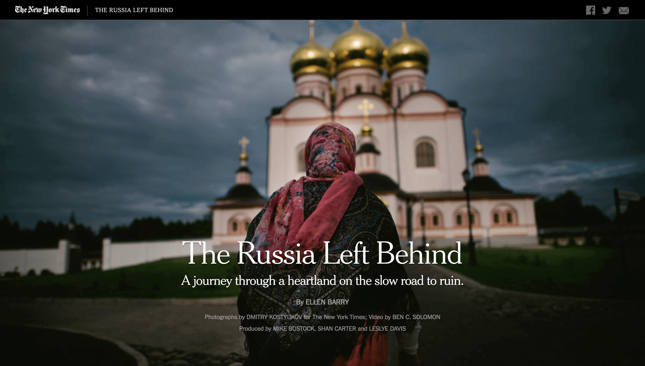
The piece not only demonstrates a fine use of parallax scrolling, it also uses a map on the left-hand side of the screen to show the reader for how far they’ve progressed in the article and how much longer they have to go.
Navigation chapters
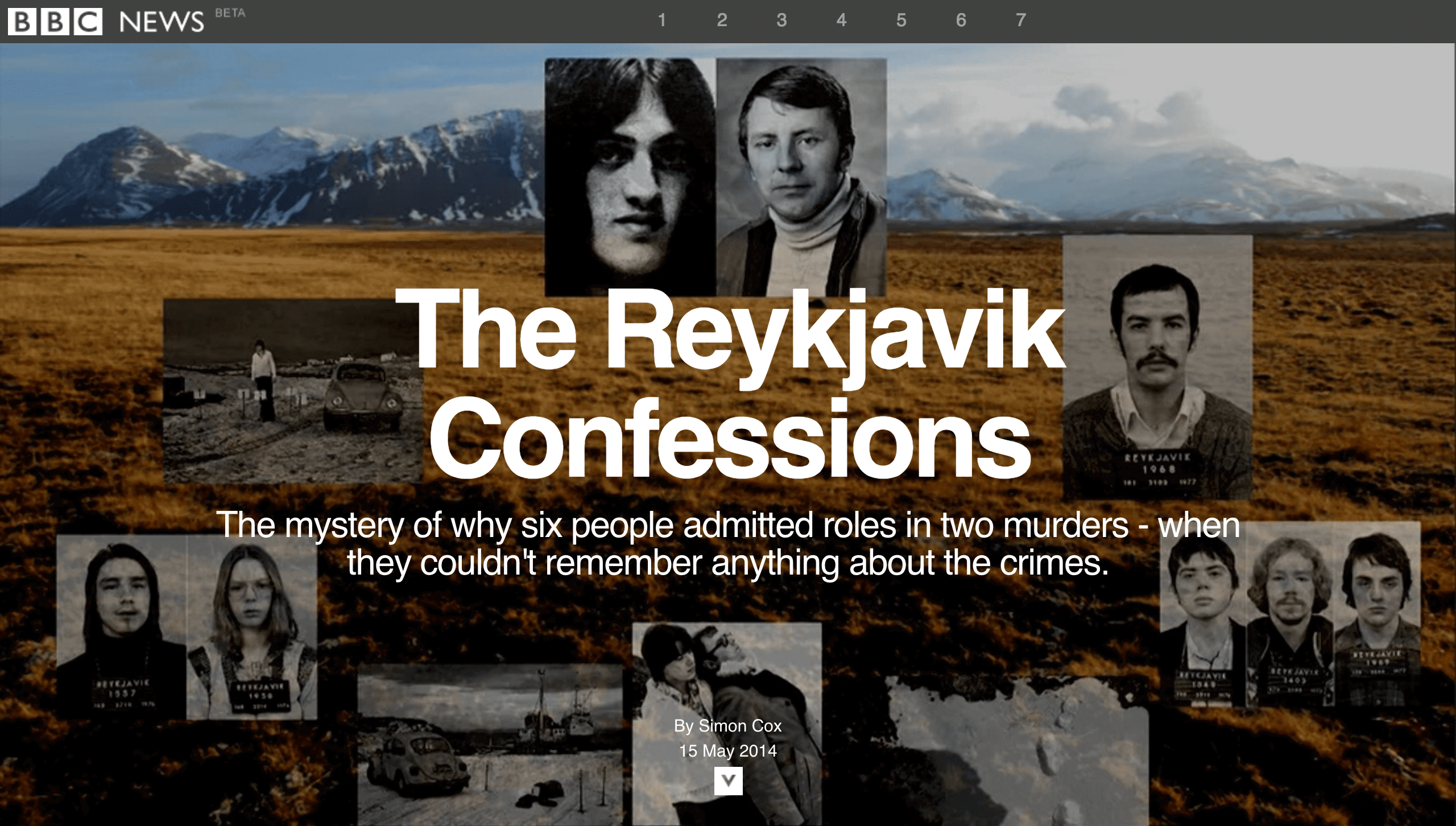
With so much content involved, adding chapters to your piece can help readers navigate through the article. An example of this is a piece from the BBC, “The Reykjavik Confessions,” The story also includes liberal use of pull quotes and images that help readers find their place as they skim through an article, or that catch attention and draw a reader in if they’re trying to decide if it’s worth the time investment. The combination of these elements keeps the story riveting through 6,385 words, all the way to the conclusion.
Include rich content.
Back in 2012, the New York Times dropped an incredible story, both as a human interest piece and as a pioneer of longform design. At over 17,000 words, “Snow Fall” tests the limits of what can be considered a news article. It is a massive piece. In spite of its length, however, many readers had little difficulty staying with it to the end.
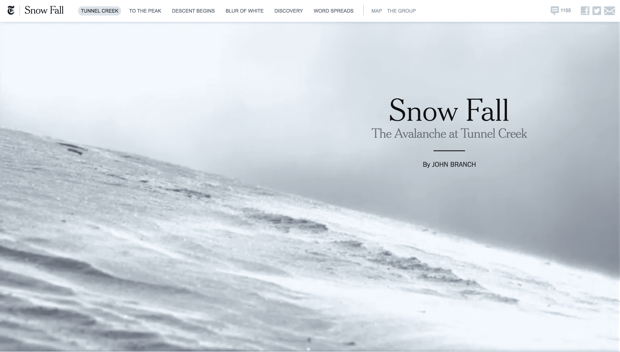
Part of the reason “Snow Fall” was so successful was its incorporation of rich design elements throughout. The piece included 3D maps to showcase parts of the story and interview segments with people involved in the event. It showed short video loops to demonstrate how snow builds up to cause avalanches. Overall, it had the feel of a documentary more than an article.
What this demonstrates is that longform design can—and should—be multimedia. Designs that are rich in images, graphics, and videos will do more to keep a reader engaged than pure text.
Don’t fear the fold.
Epic Magazine built its reputation on longform content. One of its most recent pieces, “What Goes Up,” (on the early days of news helicopters) isn’t afraid of space. They know their readers know how to scroll, and trust that they will keep doing so for 12,000 words. Because of this, they don’t hesitate to use the entire above-the-fold space for the article title.
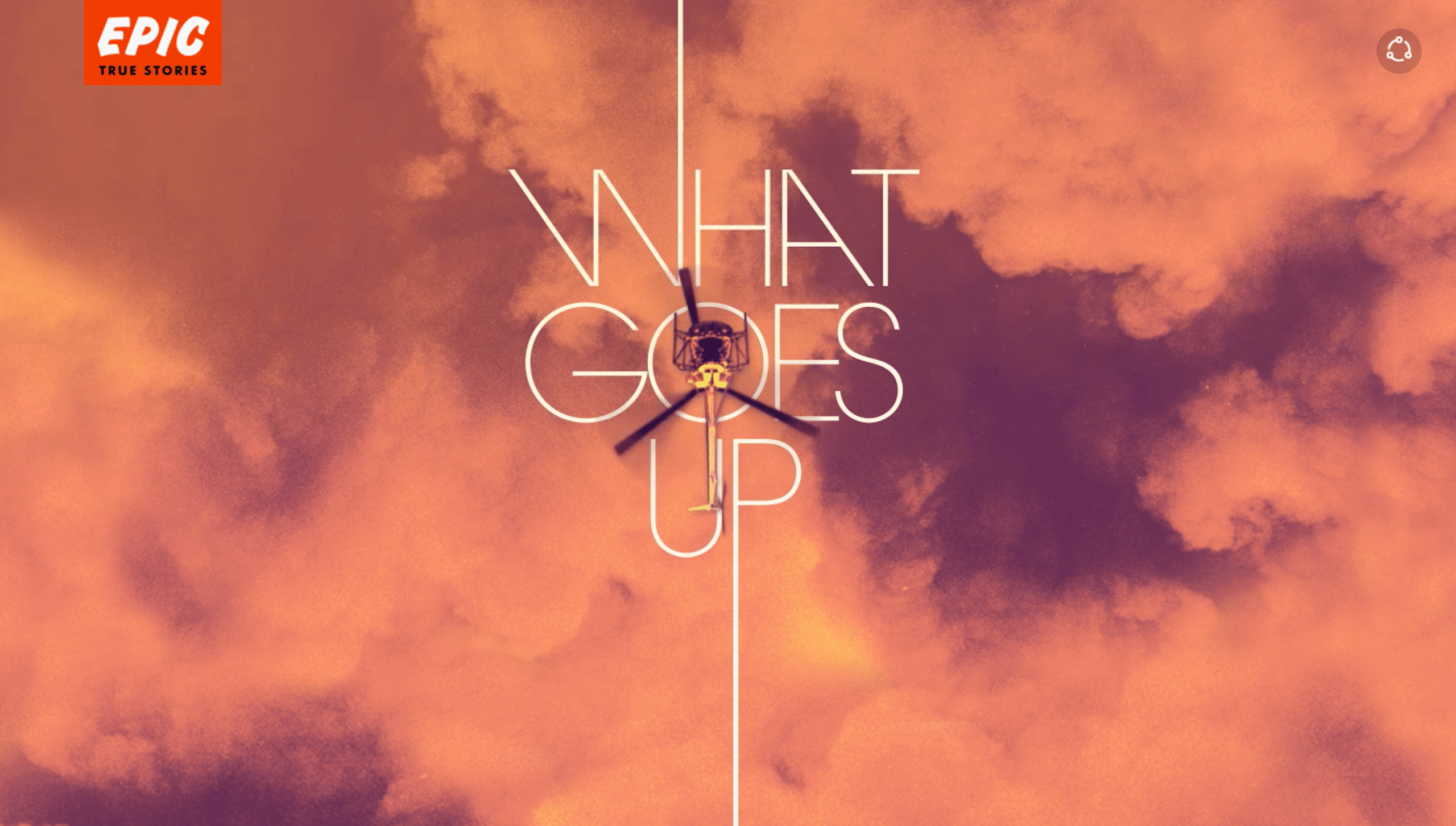
They also use the length of the stem on the ‘P’ as a signal to the reader that there’s more to see. The article design does a similar thing a little further on as the text changes color like a setting sun. It’s a beautiful and subtle encouragement to keep reading.
Which, at the end of the day, is an excellent assumption upon which to base most of your longform design. As the length and popularity of these pieces demonstrates, readers don’t need you to pack all the information the screen at once. Quite the contrary, the more you spread it out, and the more beautiful and accessible you make it, the more your readers will stay and share your content.
How does this apply to your business?
We’ve written in the past about how long blog posts out-perform short ones. But the design level present in these pieces is probably not what you’d want for a blog. Instead, think of how you could use rich content, visual cues, and navigation to help guide a lead through a significant piece of in-depth content on your website. That content could be a guide to your product, a piece of educational material, or even a case study. And, of course, if your business regularly publishes long stories such as this, then you’ll have plenty of need for thoughtful, accessible design if you want that story to spread.
As a business, the most important thing to remember is that your visitors will read your content—if it’s well-written and engaging. People leave when content is dull or difficult to read, when there are few visual cues for them to find their place, and when there are no other pieces of supporting content such as images or video.
Need help with longform for your Michigan website design? Contact us. We’d love an opportunity to work with you to create a showcase for some of your best content.